Fantasy transit in Chicago: a proposal

Building urban rail lines has always been expensive, and one of the consequences of this is that many more lines have been proposed than built. The shelves of Northwestern University’s excellent Transportation Library, for example, contain approximately 75 books or reports in which rail lines for Chicago are proposed; only something like a dozen of these lines have actually been constructed.1 Of course, numerous proposals have been made for building lines that have never even made it to the books and government reports that are collected by libraries. Here’s a 1913 proposal on a map at the University of Chicago Map Collection that was only published in cartographic form. None of the proposed new lines was actually ever implemented.


The Internet of course has been a perfect home for proposals to build new urban rail lines. Numerous “fantasy-transit” sites discuss these. Alon Levy’s Pedestrian Observations, which features long cost-benefit analyses of proposed lines, may be the best of these sites. It has quite a lot of competition.2 Other sites that deal with urban transportation issues in general, like Yonah Freemark’s The Transport Politic and Jarrett Walker’s Human Transit, have also often discussed potential new lines.

I’ve enormously enjoyed reading the posts on these sites—if you like urban rail, then contemplating new lines is a simple pleasure—but I don’t know how much effect they’ve had on actual public policy. To take just one example, if the politicians and government officials who actually decide what to build had paid much attention to what gets written on these sites, thousands of additional kilometers of “heavy-rail” transit lines would have been added—while most of the numerous short, slow, infrequent, and expensive street-running streetcar lines that have been constructed or started in the United States over the last decade would never have been considered worth building.

Discussions of new transit in Chicago in recent years have been very much like discussions of new transit elsewhere. There have been hundreds of proposals to build new lines, hardly any of which seem to have much chance of actual implementation. One example is TransitFuture’s proposal to create a grid of new CTA lines mostly to the west of the existing lines.

There have also been numerous proposals to make better use of the rail lines now run by Metra, the commuter rail agency. Many of these lines run through dense areas of the city and inner suburbs but have few city stops and infrequent service. Adding stops and service, and instigating fare integration with the city transit agency, the CTA, would seem like a no-brainer, but, despite all the proposals, nothing ever happens. The chief reason may be institutional. Metra clearly feels that longer-distance commuters constitute its major market (although many of the city stations do a great deal of business). It also fears anything that could lead to a loss of revenue.

The model for making more intensive use of suburban rail lines is of course Western Europe, where numerous cities have to a large degree integrated their rapid transit and suburban rail systems. Paris, London, Berlin, Munich, Frankfurt, and Oslo are perhaps the cities that have moved furthest in this direction. In all these places, suburban lines have been brought through the inner city in tunnels; the lines run as often as subway lines typically do; and one fare lets you ride on both the subway system and what was once the suburban system. This arrangement solves several problems at the same time. Frequent service on the suburban lines brings genuine rail rapid transit to numerous areas that did not have it and (often) express subway service to areas already served. Inner-city tunneling brings the suburban trains from peripheral stations to places where travelers actually want to go. And, even if the suburban trains themselves don’t take you to your destination, improved connections with the existing subway system enormously increase the range of easily reachable destinations. Furthermore, fare integration encourages full use of the entire system. In addition, the reduced role of stub-end stations at the edge of the CBD allows much faster service and eliminates the need to store trains on expensive land close to the city center. And (in some cases) electrification of suburban train lines (required for passage through tunnels) has made the trains faster and quieter.

Similar arrangements are rare outside of Western Europe, but they do exist. In Asia, Tokyo and Osaka have joined their suburban and urban rail systems by allowing subway trains onto the suburban railways and making through fares available. In the Western Hemisphere, only São Paulo has set up a system somewhat comparable to those in Western Europe (although without any new tunneling): subway lines and the old and much improved suburban lines have been joined into one gigantic system (see my earlier post on this system). There are some moves in this direction only in a small number of cities in North America. Denver’s brand-new suburban rail lines have fare integration with the rest of the transit system, and Philadelphia built an underground line connecting its two suburban train stations that opened in 1984, but there is no fare integration with the subway system. Furthermore, both Toronto and Montréal are planning an enormous increase in service levels on certain suburban train lines (although apparently with no fare integration in Toronto).

There have been proposals to set up “through-running” of a sort in Chicago, of which the most serious is probably CrossRail Chicago. This proposal avoids the need for downtown tunneling by suggesting that lines be joined via the St. Charles Air Line south of downtown. CrossRail comes much closer to being a thoroughly worked-out scheme than just about anything else proposed by members of the public. If it were actually built, I have no doubt that life in Chicago would be improved enormously, but it does need to be said that the line would have the peculiarity of not serving the central Loop at all, much less its northern extension. It also would have poor connections with the CTA, which does not have any rail line to Union Station, or, in fact, to most other Metra stations in Chicago and its suburbs.3 The fact that CrossRail in one form or another has been around for a decade without acquiring significant government support could be interpreted in any number of ways. Maybe it just isn’t quite radical enough to excite very many people.

Perhaps I’ve missed something obvious, but I’ve never actually seen a completely worked out proposal for through-running Chicago’s suburban trains that included service to the Loop proper and to its northern extensions.4 The geography is, indeed, a bit awkward, since service from the north now ends up in stations west of the Loop. Pedestrian Observations blogger Alon Levy, a supporter of through-running in New York (where the geography is also awkward), in a discussion of through-running in Chicago, seems to have just given up. But I wonder whether this is not rather premature. It is true that new downtown tunnels would be fantastically expensive and that the cost would have to include electrification of the lines passing through them. In a city and state with a structural deficit of billions of dollars a year, it might seem absurd to imagine that money could be found. But let us imagine that the federal government does indeed get into the business of building infrastructure on a large scale in the next few years and at least fantasize what might be done with it.

One obvious problem with rail transit in Chicago is that it (inevitably) tends to focus on the central business district as it was some decades back, when it was largely confined to the Loop proper. But the most prestigious retailing in Chicago’s CBD moved north, up Michigan Avenue, many years ago. There is only one rail station in this area now, the Red Line’s Chicago stop, and it’s three blocks from the major retail establishments at, and near, Water Tower Place. This area, in fact, is not just a retailing center. Numerous hotels and densely built-up residential districts are close by, as are Chicago’s most prestigious hospital, Northwestern Memorial Hospital, and its neighbors, the highly regarded Rehabilitation Institute of Chicago and Chicago Children’s Hospital. There are also numerous offices in the area, and even more closer to the River, a few blocks south. Setting up through-running of suburban train lines would ideally solve the problem of poor rail transit in this area.

As it happens, Metra’s major north-south line (UP-North) is roughly 2 km west of Water Tower. Why not run this line east from just south of the Clybourn station over to Michigan Avenue (or just east of it)? Passengers wanting to travel south to Ogilvie Station (formerly the Northwestern Terminal) could change at Clybourn, which is served by two UP lines. There would be connections with the Red and Brown Line stations on Chicago Avenue. The tunnel would turn south somewhere around Michigan Avenue (or maybe Columbus). It would need to be very deep, partly because the area is so built up, and partly because the turn near Water Tower Place would only be possible with a radius large enough to require passing under some existing buildings. The tunnel would join with the already electrified Metra Electric at Millennium Park. There would have to be another east-west tunnel somewhere south of this, perhaps under Monroe Street, that would have connections with Red and Blue Line stations as well as with those on the Loop. Again, a very deep tunnel would be required, partly so that it could pass under the existing subways and other infrastructure and partly because large-radius turns to and from Metra Electric and the tracks to Union Station would require going under some existing buildings. The tunnel would join with the existing tracks north of Union Station (and, in an ideal world, with the Rock Island tracks as well).

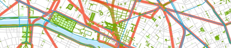
Here’s what this looks like on a map:

Map, Metra and CTA rail lines (actual and fantasy), central Chicago, Illinois

Central Chicago showing proposed new Metra lines as well as existing CTA and Metra lines. The filled circles are stations. The large brown circles mark both new stations and existing stations that would presumably acquire new underground tracks. Most of the base GIS data come from the City of Chicago’s data portal.

And here’s the larger picture: a view of Chicago and its inner suburbs showing the relationship between CTA lines and Metra rapid transit lines:

Map, Metra and CTA rail lines (actual and fantasy), Chicago and vicinity, Illinois 9and a small part of Indiana)

CTA lines and the five Metra rapid transit lines mentioned briefly in the text. Assumes that rapid transit is extended only to inner suburbs. There are of course many other possibilities.

This arrangement would permit many different service patterns. Perhaps Metra Electric (“IC”) trains could be rerouted through the east-west Loop tunnel and end up in O’Hare (thus providing the express service to O’Hare that Mayor Emanuel has been supporting). Trains from Evanston (or further north) might pass via Water Tower and the Millennium Station to the east-west tunnel, and turn south at Union Station to, say the Burlington Line (although there is more city demand on the Rock Island Line, which now terminates at the LaSalle Station). Additional suburban lines could be joined in eventually.

Service on the Chicago and inner-suburban portions of the main suburban lines might be every 15 minutes all day and every 7.5 minutes through the east-west tunnel (since two lines would share it), and could, of course, be even more frequent during rush hour. If more suburban lines were brought into the system, service on the shared tunnel stretches could become even better. Chicago and its inner suburbs would thus gain an enormous amount of new rapid rail transit that would in fact be much more rapid than the existing lines. Suburbanites would find it much easier to get where they wanted to go, either because the trains would actually take them there or because connections would be easier. The elimination of noisy diesel engines on the affected routes would improve the environment. And fast-accelerating electric trains could make a few additional city stops without increasing their total transit time unreasonably. The trains would also no longer have to crawl into stub-end stations at 10 kph, since the stations would be through stations.

Altogether something like 5.8 km of tunneling and several new stations would be required. This construction, along with electrification, might cost something like ten or fifteen billion dollars, a huge amount but not an unimaginable sum in an urban area of perhaps eight or nine million people if there were a generous federal subsidy. The Chicago urban area is only a little smaller than the Paris and London urban areas where much larger rail building plans have been completed, and where even larger and more expensive projects are under way. Construction would of course take several years but would not have to be enormously disruptive, since the new tunnels would generally be so far beneath the surface.

Of course, all this is just a fantasy!

  1. Figure based on a quick perusal of titles with subject heading “Local transit—Illinois—Chicago (or: Chicago Metropolitan Area)–Planning” or having a call number beginning with HE4491.C4. I didn’t look at every item.
  2. See blogroll on Pedestrian Observations for a very partial list.
  3. I acknowledge the exceptions, Irving Park, Main Street Evanston, Oak Park/Harlem-Lake, 35th-Lou Jones/Sox-35th. Downtown, the LaSalle Street and Millennium stations are within a block of CTA lines.
  4. “Itinerant urbanist” Sandy Johnson once proposed an east-west Loop line, but it misses the Near North Side.

Posted in Transportation, Urban | 7 Comments

The “park connectors” of Singapore

Singapore is often described by urbanists as having gotten a great many things right. An explicit goal of Singapore’s planning is to have a “car-lite” society. Singapore’s government has taxed automobiles at a very high rate for many years. It also charges for parking and for automobile access to its downtown. In addition, an excellent two-line rail system was built in the late 1980s and early 1990s, and since 2000 it’s been extended by an enormous amount.
Northeast Rail Line, Singapore

The interior of a car on the Northeast Rail Line, Singapore. Note the open gangways. The Northeast Line, like other new rail lines in Singapore, is driverless.

Furthermore, Singapore has built a huge stock of reasonably high-density public housing and has induced most of its population to move in. In recent years it’s upgraded most of the original structures. As a result, Singapore is often said to have the world’s most elegant public housing.

Pinnacle@Duxton, recently constructed public housing in Singapore.

Many statistics support the view that Singapore’s planning has been pretty successful. Public transit usage is very high and continues to grow. Traffic jams are rare. Air quality is chiefly compromised by the burning of forests in nearby Sumatra, not by locally produced automobile exhaust.

A more cynical view would note that automobile ownership of something like 15% is quite substantial given the high taxes. There is quite an elaborate network of freeways covering the island, and the cost of entering downtown by car (between 0.50 and 2.50 Singapore dollars depending on the time of day, that is, approximately between 0.35 and 1.75 USD) is not enough to discourage driving there. Roads in Singapore are actually pretty crowded. There is also the odd issue that the association of automobile ownership and wealth has perhaps not surprisingly added to the prestige of owning a car.1

Then there’s the question of facilities for pedestrians. I’ve been in Singapore every few years since the 1990s, and the thing that used to bother me most was how difficult it was to walk long distances there. It’s always been comfortable enough to walk along Orchard Road (Singapore’s main central shopping area) as well as in its downtown, and to some extent in near-downtown carefully preserved ethnic districts like Chinatown and Little India. All these areas are pleasantly crowded; they mostly have wide sidewalks; and the urban landscape has an attractively complicated texture. But everywhere else one had to walk along busy roads with few pedestrians and to wait endless minutes for red lights to change. The high-density HDB (Housing and Development Board) projects with their tower-in-a-park designs and lack of shopping streets or complete grids seemed especially unattractive for walking. Furthermore, most of the island’s many parks were somewhat empty, and I couldn’t help but notice that nearly all the runners in parks were ethnic Europeans, that is, presumably expatriates or tourists. I asked Singaporeans about this on several occasions and was reminded that it was always hot and humid in Singapore (it is) and that urban pedestrian life was simply not part of Singapore’s traditional culture. This may be perfectly true, but it’s also the case that a rail system cannot function fully unless some of its users are willing to walk to it. I haven’t been able to help wondering whether Singapore’s distinctive addition of people-movers (called the “LRT”) to its rail lines wasn’t a function in part of its citizens’ reluctance to walk even short distances to the trains.

Things have changed since the 1990s. Singapore’s planners have clearly realized that poor pedestrian facilities were anomalous and have begun remedying the situation, and I spent some time last week exploring the results.

Part of the Whampoa park connector, which winds past many HDB (Housing and Development Board) projects north of downtown.

Most of the new pedestrian facilities are part of a system of what are called “park connectors,” built largely along the many partly artificial waterways that drain the island (Singapore gets more than 2300 mm of rain a year).2 The name is a little odd and may reflect a reluctance on the part of Singapore’s planners to take pedestrian facilities quite seriously. The park connectors do often connect parks, but, in fact, they don’t always, and I was struck by the number of people walking along the park connectors who were carrying shopping bags. That is, the “park connectors” get some practical use too. But you also see quite a number of hikers, runners (who seem to be native Singaporeans), and even some cyclists.

Park connectors and MRT rail lines, Singapore.

Map showing rail lines and major pedestrian facilities in Singapore. The latter include all official “park connectors” and some adjoining segments of the Southern Ridges and Singapore River trails. Short paths in parks are excluded. Based on data from OpenStreetMap (which I’ve modified a great deal.)

Parts of the system of park connectors date as far back as 1992 (and some follow routes that existed before this), but growth was slow at first. There were 12 km of park connectors in 19963 and perhaps 100 km in 2010.4 In recent years much more energy has been put into constructing them, and in September 2015 the park connector system reached 300 km in length. Many new segments are under construction or planned, including a 150-km Round Island Route. (For comparison, the rail transit system is up to 170 km.) As the system has grown, the park connectors have been given much more consistent visual branding

Standard signs along park connectors. There are also fairly standard maps, and “PCN” (for “park connector network”) is painted on the ground every so often.

and they are even increasingly mentioned in tourist literature.

A small fragment of a “Singapore Island map” on the verso of: The official map of Singapore. Singapore : Reddot Maps, 2017. Several of the major park connectors (along with other tourist attractions) are shown on the map.

In addition to formally designated park connectors, there are also some urban trails through the few areas of more or less natural landscape left in Singapore. A series of what were once rough trails along the Southern Ridges near the old port, for example, have been improved and even acquired an extremely pleasant canopy-top walkway.

Forest Walk in the Southern Ridges.

There is also an excellent trail up to Singapore’s 164-m high Bukit Timah (the highest place on the island). I suspect that Singapore here, as it must do in many other ways, is competing with Hong Kong, which has what may be the world’s best network of urban trails. There is nothing Singapore can do to acquire Hong Kong’s mountains, but it’s come as close as it can with the Southern Ridges and Bukit Timah trails.

Besides these trails, the Rail Corridor that was left by the removal of tracks on the Singapore portion of the old Singapore-Kuala Lumpur railway is supposed to be turned into an additional facility for pedestrians and cyclists. It’s been described as Singapore’s “High Line,” but, in fact, it’s nothing like the High Line, since only a small part of it is raised, and it mostly passes through industrial or medium-density areas. It’s more like many of the rail trails that have been built all over the world in recent years.

The unimproved Rail Corridor between the Hillview and Cashew MRT (subway) stations.

Fixing the Rail Corridor up will take some money since there are missing bridges and a need for improved drainage, but, when I was in Singapore, the whole southern part of the Corridor was closed to facilitate the work.

A missing bridge in the Rail Corridor near Hillview MRT station.

Singapore’s pedestrian facilities are definitely still a work in progress. There are many gaps in the “network.” This doesn’t matter in the way it would for a rail network, but it does matter some. Also, most of the routes intersect with numerous streets, and only in a few cases is crossing facilitated by tunnels or bridges. Sometimes crosswalks help (Singapore drivers usually respect these), but, whenever there’s a major street to cross, park connector users must deal with a slow-to-change traffic light. Cyclists are even more inconvenienced than pedestrians by the lack of long rights-of-way. There is also the larger issue that, in building park connectors mostly along watercourses or in parks, planners have of necessity paid little attention to where people might actually want to go. This is of course a problem with pedestrian facilities all over the world. They mostly get built where it’s easy and cheap to build them.

Despite these caveats, Singapore’s pedestrian connectors strike me as a major accomplishment. One can be as dubious as one wants about the authoritarian side of Singapore’s government, but one must admit that Singapore’s tradition of central planning has resulted in some extremely impressive urbanism.

  1. For additional information on the history of Singapore’s planning, see (among other sources): Martin Perry, Lily Kong, and Brenda Yeoh. Singapore : a developmental city state. Chichester : John Wiley & Sons, 1997.
  2. Major sources: Planning Singapore: from plan to implementation / edited by Belinda K. P. Yuen. Singapore : NUS Press, 1998, especially pages 31-41. Also: the well-indexed major newspaper Straits Times and the National Parks Website.
  3. Yuen, previous footnote.
  4. Mark Lewis. The rough guide to Singapore. London : Rough Guides, 2010.

Posted in Transportation, Urban | 1 Comment

The recent geography of gentrification in Chicago

There is a widespread sense that some parts of Chicago are gentrifying at a rapid pace. Rising rents in many neighborhoods have been cited as support for this view.


I downloaded and mapped data from the recently released 2011/2015 American Community Survey (ACS) in order to examine the geography of recent gentrification in Chicago.

To interpret these maps, one needs to understand that some academic work on gentrification portrays it as a kind of wave, moving regularly block by block or tract by tract, in which neighborhoods are completely transformed as their old inhabitants are displaced by wealthier newcomers.1 Some of the many activists who oppose gentrification seem to accept this view as well, although they’re more likely to talk about neighborhoods than census tracts.2

Recent ACS data suggest that gentrification in Chicago in the last few years often hasn’t quite worked that way. Its geography has been much more complicated.

Here’s a map showing the change in real per capita income by census tract between the 2006/2010 ACS and the 2011/2015 ACS:3

Change in real per capita income by census tract, Chicago and vicinity, 2006/2010-2011/2015

Here’s a similar map for the region:

Change in real per capita income by census tract, Chicago region, 2006/2010-2011/2015
Someone wedded to the idea of gentrification as a wave could certainly find evidence for it in the dozen or so tracts in Logan Square, West Town, Humboldt Park, North Center, Uptown, and western Lake View where per capita income was up by 25% or more. Gentrification on the North Side does indeed seem to be moving west and north and cutting into the few remaining pockets of poverty. But, in fact, there are tracts with similar income rises scattered throughout the urban area. Many (maybe most) of those in the city include areas where high-rise housing projects were removed in the years between the 2006/2010 and 2011/2015 surveys, for example, the tracts covering the part of the city where Cabrini-Green Homes once stood. A change in building stock was associated with an increase in wealth in several other areas as well, for example in the West Loop, where new expensive housing has mostly replaced parking lots and industrial buildings. Whatever one thinks of this process, it would be simplistic to describe it as a wave of rich people displacing the poor.

What most struck me about these maps is how widespread an increase in per capita income has been in the Chicago area. All the tracts colored red or pink showed a positive change; that is, they did better than average. Such tracts are commoner on the North Side than the South Side, and perhaps a little commoner close to the Loop than away from it. But the spatial differences do not make a dramatically clear pattern. Gentrification as measured by income change between 2006/2010 and 2011/2015 seems to have been widespread. It was only to a limited degree strongly focused on a few areas. There is additional evidence for this view, for example, in the continued influx of white people into numerous North Side and near-downtown neighborhoods. The fact that the city of Chicago, unlike the Chicago Metropolitan Statistical Area, the state of Illinois, or the United States as a whole, emerged from the Great Recession as wealthy as it was before the recession began provides further support for the idea that a modest amount of gentrification has been widespread in Chicago.4

Some of the areas of rising income were near the northern and northwestern edges of the city. It’s possible that middle-income people have become more willing to live in traditionally working-class neighborhoods like Albany Park and West Ridge (West Rogers Park) than in the past. Newcomers may have raised the per capita income of parts of these areas a little bit, but these were already reasonably healthy places, and most newcomers weren’t really wealthy. Calling population turnover there “gentrification” without some qualification seems like a distortion.

But it was more complicated than that. A surprising number of tracts experienced a decline in real per capita income. Some of these are in relatively poor areas, but many are in parts of the city and suburbs that are generally considered quite prosperous. The latter changes may be due to declining income among older people who make up a large part of the population in some areas, for example, along the North Side Lakefront. There was also a well-documented influx of renters in condo buildings whose departing owners have found it more profitable to rent than to sell. Rents in condo buildings aren’t usually low, and renters in these buildings aren’t likely to be really poor, but in most cases they’re probably poorer (and younger) than their landlords.

The details on the map need to be viewed skeptically, since ACS data have very high margins of error, easily enough to move a substantial portion of tracts one or two categories up or down. The complicated patchwork of income changes may not be due to the existence of a complicated microgeography as much as to noise introduced by the necessarily approximate data, at least in part. The difference between, say, a 10% change and a 25% change portrayed on the maps may not be completely meaningful.

There’s another reason for caution. The 2006/2010 period included both the last year of the early 21st-century boom and the low point of the Great Recession, while the 2011/2015 period was generally one of recovery from that low point. Dealing with ACS data is not like dealing with traditional census data, which aims to report conditions on a single day. During a five-year period over the course of which there were substantial changes, even a small spatial difference in different years’ sampling would result in inaccuracies in maps like these that show changes. I don’t know the extent to which the Census Bureau corrected for this.

Let me add that, even if there is reason to suspect that the figures are only approximations, broadly speaking they seem about right. Here’s a 2011/2015 map of per capita income in Chicago and vicinity:

Per capita income by census tract, Chicago and vicinity, 2011/2015

Here’s a comparable map for the region:

Per capita income by census tract, Chicago region, 2011/2015

These maps look pretty accurate.

Income is of course not the only way to measure gentrification. Changing education levels and a change in the distribution of occupations are two additional areas where census data are available.

Here’s a map of Chicago and vicinity showing the change between 2006/2010 and 2011/2015 in the percentage of people 25 and older with a college degree:

Change in [ercent of population 25 and over with college degree by census tract, Chicago and vicinity, 2006/2010-2011/2015

Here’s a comparable map for the region:

Change in [ercent of population 25 and over with college degree by census tract, Chicago region, 2006/2010-2011/2015

Here too there are surprisingly complicated patterns that do not suggest wholesale recent replacements of minimally educated people by well-educated ones in a spatially simple wave. A major impediment to interpreting these maps is that there has generally been an increase in the proportion of the population with a college degree, even among relatively poor people. Some of the tracts where there are have been the largest increases in the percent of those with college degrees are in fact in problem-ridden areas on the South and West Sides. In many cases the percent went from very low to just low. You really need a general map showing percentage of the population 25 and over with a college degree to interpret these maps. Here is such a map for Chicago and vicinity in 2011/2015:

Percent of population 25 and over with college degree by census tract, Chicago and vicinity, 2011/2015

And here’s a regional map:Percent of population 25 and over with college degree by census tract, Chicago region, 2011/2015

Generally speaking, the maps of change in education level, at least for areas that started with a moderate level of educational attainment, have a message that’s similar to that of the income maps: There seems to have been continued slow increase in education levels in many North and Northwest Side neighborhoods (especially those away from the long-prosperous Lakefront), as well as around the Loop, but, over the five years covered by the two ACS surveys, changes were so spotty that they are hard to interpret in a simple way. There does not seem to have been a wave of gentrification displacing all before it. However, with education as with income it’s pretty clear that the city did better than the metropolitan area, the state, and the nation.5 There is every reason to think that there’s been continued slow gentrification as measured by educational level, just as there has been by income; it’s just that it hasn’t been spatially simple.

Maps that show changes over more years reveal much simpler geographies. Here’s a set of maps much like those above that shows changes between 2000 (with data from the old long form) and 2011/2015 (with data from the ACS). There were many adjustments in census tract boundaries in these years, and I’ve used the analysis worked up by the Longitudinal Tract Database project at Brown University to put 2000 data into 2010 boundaries. As the authors6 of this wonderful source of data would be the first to admit, reworking data compiled for one set of boundaries into a different set of boundaries inevitably results in some distortions.

Despite this caveat, these maps all show a much more lucid geography than the 2006/2010 to 2011/2015 map set, no doubt in part because, with more years, patterns got clearer. It also seems to be the case that changes were more intense and more geographically coherent in the first years of the 21st century than afterward. To sum these up: There was a pretty substantial increase in income and educational attainment in many North Side neighborhoods (especially away from the Lake) in the first dozen or so years of the 21st century. The areas around the Loop (including those on the South Side) also did well. Some poor neighborhoods got poorer, while others (Bronzeville, for example) may have really turned around. Chicago in general did better than its suburbs. Nearly all the dramatic increases in income and educational attainment in the Chicago area occurred within the city’s boundaries.

Change in real per capita income by census tract, Chicago region, 1999-2011/2015


As for those dramatically rising rents, it may just be that many people are having to pay a larger percentage of income for housing than they used to. (Condo owners, the value of whose properties is in many cases lower than before the Great Recession, may be paying less.) Whether the current construction boom will change this, time will tell.

  1. Examples of this view:

    Jeffrey M. Timberlake and Elaina Johns-Wolfe. “Neighborhood ethnoracial composition in Chicago and New York, 1980 to 2010,” Urban affairs review, 2016.

    Chicago gentrification map, 2000 to present,” Governing the states and localities. 2017.

    One trouble with this approach is that it ignores the fact that there are degrees of gentrification. The common trope of a gentrified neighborhood as one slowly transformed from a neighborhood of the poor (or a non-residential area) into one to which a few artists and other eccentrics have moved into one increasingly fashionable and eventually affordable only by the wealthy is a pretty good description of what has actually happened in some cases, at least in New York.

  2. Thus, for example, Logan Square has often been said to be a recent target of gentrifiers (although the housing along Logan Boulevard has arguably never been housing for the poor and certainly isn’t now). See, for example, Kelly Hayes. “The unbearable whiteness of brunch : fighting gentrification in Chicago,” Truth-out. 13 January 2017.

    For an analogous piece on Pilsen, see Mae Rice. “Can anyone stop Pilsen from gentrifying?The Chicagoist. June 28 2016.

  3. I’ve preferred to use per capita rather than household income as a measure, since it’s not influenced, very much anyway, by changes in household size. Maps of changed household income look very much like maps of changed per capita income, although they do show outer-city and suburban areas, where household sizes are larger, comparatively somewhat richer than inner-city areas.

    All figures on the income maps have been corrected for inflation, based on mid-year CPI data.

  4. Here are some figures. These are from the 2006/2010 and 2011/2015 American Community Survey, downloaded from the Census Bureau Website or NHGIS:

    2006/2010 Chicago city per capita income 27148
    2006/2010 Chicago MSA per capita income 30453
    2006/2010 Illinois per capita income 28782
    2006/2010 U.S. per capita income 27334

    2011/2015 Chicago city per capita income 29486
    2011/2015 Chicago MSA per capita income 32009
    2011/2015 Illinois per capita income 30494
    2011/2015 U.S. per capita income 28930

    Difference 2006/2010-2011/2015 with 8.7% inflation factored in:

    Chicago city        -0.0%
    Chicago MSA      -3.3%
    Illinois                  -2.5%
    U.S.                       -2.6%

    New York during this period also had a real per capita income change (30498 to 33078) of -0.0%; San Francisco (from 45478 to 52220) of +5.6%.

  5. Here are some figures:

    2006/2010 Chicago city percent of population 25 and over with college degree 32.246
    2006/2010 Chicago MSA percent of population 25 and over with college degree 33.359
    2006/2010 Illinois percent of population 25 and over with college degree 30.277
    2006/2010 U.S. percent of population 25 and over with college degree 27.902

    2011/2015 Chicago city percent of population 25 and over with college degree 35.552
    2011/2015 Chicago MSA percent of population 25 and over with college degree 35.461
    2011/2015 Illinois percent of population 25 and over with college degree 32.300
    2011/2015 U.S. percent of population 25 and over with college degree 29.770

    Difference 2006/2010-2011/2015:

    Chicago city        +10.3%
    Chicago MSA      +6.3%
    Illinois                  +6.7%
    U.S.                       +8.2%

    Note that in 2006/2010, the college degree percentage was higher for the MSA than for the city, while in 2011/2015 the percentage was higher for the city (possible factor: the definition of the MSA changed slightly between those years).

    In New York during this period the percentage of the population 25 and older with college degrees went up by 7.2% (from 33.271 to 35.650); in San Francisco by 5.1% (from 51.221 to 53.831). In comparison to other cities, Chicago thus seems to be doing better at attracting college graduates than at attracting the rich, perhaps tending to add people at an earlier stage of their careers than, say, New York.

  6. John Logan of Brown University, Zengwang Xu of the University of Wisconsin, Milwaukee, and Brian Stults of Florida State University.

Posted in Urban | Leave a comment

BRT, TRT, and a Metro U/C in Quito

There has been an enormous increase in the amount of bus rapid transit (BRT) in the world over the last forty years. While there are substantial BRT lines in many cities in well-off countries (for example, in Ottawa and Los Angeles), a very large proportion of new construction has occurred in middle-income countries, especially in Latin America. According to the BRTData site, more than half the world’s BRT passengers are in Latin American cities. BRT does not have the aesthetic and practical advantages of being completely separate from the street network, but it provides a fairly speedy transit service for a relatively modest price and can be installed much more quickly than a rail line. It fits medium-density cities in middle-income countries very well. Curitiba, Brazil, was probably the first city to adopt modern BRT on a large scale, something it began to do in 1974. The largest network is in Bogotá, where the first segment of the TransMilenio system opened in 2000.


Quito’s BRT network is less well-known, but Quito may have been the first large Latin American city outside of Brazil to adopt BRT (1995), and it may have more BRT kilometers in relation to its population than any other big Latin American city.1 Its first line, a trolleybus line, called “El Trole” in local Spanish, remains quite distinctive.

I was in Quito last week for the first time since 1978 and naturally spent some time taking a look at transit there.

Quito’s transport history can only be understood in light of its physical geography. Most of the population of Quito lives in a long valley at an elevation of approximately 2800 m, stretching something like 30 km north-south but only between 3 and 4 km east-west. On the west is the 4785-m-high active Volcán Pichincha, which forms an absolute barrier (although there is housing on the lower slopes). To the east there are much lower and less regular ridges followed generally by deep valleys, and the city has spread eastward in many places. But the city’s main “desire lines” are definitely north-south. There can be huge traffic jams on major roads, especially near and just to the north of the Centro Histórico, and there is a serious pollution problem.

The city’s human geography has also played some role in determining the history and location of its transit lines. The Centro Histórico—sometimes labeled the best-preserved colonial city center in Latin America—was pretty rundown thirty years ago, but, with the rise of mass tourism and a widespread understanding of the touristic value of having an attractive central city, it has slowly been revived. Buildings have been renovated; museums have been built; policing has improved; and the streets are often pleasantly crowded—even the ones with 20% slopes!

The Plaza Grande in Quito’s Centro Histórico.

Many central-business-district functions can still be found in the Centro Histórico, but, as money from oil and other sources has worked its way through Ecuador’s economy, such activities have grown in scale, and new private and government offices and tourist facilities have sprung up over a fairly substantial zone north of the Centro Histórico, following a universal rule in urban geography that, other things being equal, the CBD tends to move toward wealth. Generally, neighborhoods north of the Centro are much better off (and more traffic-ridden) than neighborhoods south of the Centro, a fact that has played a major role in transport planning.

Until the mid-1990s, the city’s “public” transport consisted entirely of private bus lines, running as in much of the Third World largely when vehicles were filled. There was only light regulation of these lines, and the buses (it was said) often become involved in crashes and were major contributors to the city’s poor air.

Quito’s elaborate BRT system has been created over the last 21 years as a way to ameliorate these issues: to reduce traffic jams, to improve air quality, and to fulfill a desire to have a safe and modern public-transport system. There are three distinct groups of BRT lines. The now 24-km-long Trole is the oldest. The Ecovía, a more traditional BRT line with a length now up to at least 22 km, running generally a few blocks east of the Trole,2 was the second line. The initial segment opened in 2001, and major extensions have been added since. A third set of BRT lines (which has gone under several different names3) began to be constructed along the western edge of Quito in 2004, and significant extensions have followed. Its length is now approximately 25 km (although there are still some short sections where buses do not have their own right of way). Because the major roads along which the western lines were constructed pass something like a kilometer west of the Centro, the western corridor includes a spur that intersects with the two other lines just north of the Centro Histórico. These lines are shown on the accompanying map. All three groups of lines run roughly north-south and serve neighborhoods on both sides of the Centro Histórico, although in every case the northern lines were built first.

Map, bus and trolley rapid transit and the future metro, Quito, Ecuador

Quito’s Metrobús-Q lines and the approximate alignment of the Metro. Base data from OpenStreetMap, modified a great deal.

Quito’s BRT lines benefit from lane separation and fare prepayment but do not otherwise have access to all the possible advantages of BRT. They generally run along major roads that have cross streets. Although there are a few underpasses at major intersections, there is no signal preemption, and buses must stop for red lights. Bus lanes are separated from lanes for cars by a low barrier, but are used for ambulances, police cars, and sometimes (illegally) for other traffic too. There generally isn’t room for passing lanes, and there isn’t much express service. Stops come along every 500 meters or so. Quito’s BRT lines are faster than traditional buses, but they are definitely not speedy.

Nonetheless, the lines do attract quite a number of passengers. The Trole’s weekday passenger load of something like 250,000 is extraordinary in an urban area of 2.7 million. Approximately half a million passengers a day ride the three groups of lines. Crowding—and associated pickpocketing!—are the chief subjects of user complaints. To improve service, the city has been running vehicles ever more frequently and has purchased new and larger buses. About half the vehicles on the Trole line when I was there were “biarticulated” 27-meter-long diesel buses. These can transport 250 passengers, but of course they are noisier and more likely to pollute than the older trolleybuses.

Santa Clara trole station

The Santa Clara trole station. Note the “biarticulated” bus.

All of the lines have been built by a public authority, the name of which has changed from the Sistema Integrado de Transporte Metropolitano (SITM-Q) to the Empresa Pública Metropolitana de Transporte de Pasajeros de Quito (EPMTPQ). The lines are referred to by the brand name Metrobús-Q. Operation of the lines has been split between government and private companies. Fares are 0.25 USD on all the lines—and that includes free transfers to feeder lines that serve some terminals. The low fare is said actually to pay for operational costs.

There seems to be a general feeling in Quito that, as successful as the BRT system has been, it has definitely not solved the city’s traffic and pollution problems, and a 22-km-long Metro line has been under construction since 2012. It’s scheduled to open in 2019. The line roughly parallels the BRT routes, although it makes minor detours to serve places (like the University and parts of the Centro Histórico) that the BRT lines miss.

Quito Metro under construction

The Iñaquito Metro station under construction, in one of the prosperous residential and commercial neighborhoods north of the Centro Histórico.

I was quite impressed that a medium-sized city in a medium-income country would have put so much energy into building its public transit system.

  1. Among sources consulted:
    (1) The newspaper El Comercio, which has good coverage of transit issues;
    (2) Lloyd Wright. “Latin American busways : moving people rather than cars,” Natural resources forum, volume 25, issue 2 (2001), pages 121-134 (also available in JSTOR);
    (3) Dario Hidalgo and Pierre Graftieux. Case study : Metrobús-Q, Quito, Ecuador. World Bank, 2008?;
    (4) Gerhard Menckhoff. Latin American experience with bus rapid transit. 5th International Environmentally Friendly Vehicle Conference Baltimore, September 10-12, 2012.
  2. The branch to the south of the Centro Histórico is sometimes just known as the Corredor Sur Oriental.
  3. The original northern branch is sometimes called the Corredor Central Norte. Its more recent southern extension is sometimes known as the Corredor Sur Occidental. The whole line is sometimes labeled the Troncal Occidental.

Posted in Transportation, Urban | Leave a comment

Change in population by “race” and Hispanic status, Chicago area, 2010-2011/2015

The Census Bureau released the 2011/2015 American Community Survey (ACS) tract-level data this week. I’ve used these data to map tract-level ethnic changes between 2010 and 2011/2015 for the Chicago area. These maps are comparable to the 2000-2010, 1990-2000, and 1980-1990 maps that I made while working at the University of Chicago Library’s Map Collection.


Note the following:

[1] ACS data are for five-year periods, not single years. The median year of 2011/2015 data would be 2013, and these maps can be thought of showing changes for an average of three years from 2010, but in fact (as confusing as this may be) they show changes between April 1 2010 and the 2011/2015 period.

[2] ACS data are not anything like as accurate as decennial census data or even the long-form data they replace. They are based on a sample, and it’s a much smaller sample than was used to compile the long-form data. The margins of error can be huge, especially for smaller numbers. Thus, at the tract level, these data are at best only rough approximations. The sample sizes are large enough so that general trends should be meaningful, but it’s perhaps best not to pay too much attention to the figures for individual census tracts.

[3] The “race” data for non-Hispanic whites, non-Hispanic African-Americans, and non-Hispanic Asians and Pacific Islanders include only people who classified themselves as being of a single race. This includes the great majority of respondents for all years and probably does not alter the broad patterns at all. It’s possible, however, that including people who identified themselves as being “multiracial” would have affected the results for quite a number of tracts in the city of Chicago. The question of just how to apportion these data, however, is not one that has an obvious answer.

[4] The boundary of the city of Chicago is shown by a heavy black line. Freeways are shown in blue. Tract boundaries are shown in gray. The location of dots within tracts is random.

Some general conclusions:

The Chicago area gained very few people between 2010 and 2011/2015, but there were some noticeable changes in the distribution of its population by “race” and Hispanic status. Many distributional shifts continued those of earlier decades, but there were some (mostly) subtle changes as well.

[1] There continued to be a substantial increase in the number white people in the city of Chicago, especially in the area around the Loop and on the North and Northwest Sides. Older, formerly mostly white inner suburbs continued to lose some of their white population. Somewhat new: There was only a modest increase in white population in the outer suburbs. A factor here is surely that there just wasn’t that much outer-suburb greenfield construction in this post-recession period.

[2] Problem-ridden African-American neighborhoods like Englewood and North Lawndale continued to lose population. Healthier, mostly African-American neighborhoods like Bronzeville continued to gain population. There was also a gain in African-American population in many suburban areas and here and there in the city of Chicago. Hardly any part of the Chicago area is still nearly all white.

[3] Asian population declined in some of the Far North Side enclaves where Asians had concentrated in earlier decades, but it increased in some other tracts not far away. There was a continued growth of Asian population near the Loop and west of Chinatown—in Bridgeport and McKinley Park, for example—and, on an even larger scale, in many suburban areas, especially in the West and Northwest. But, except for Chinatown, no part of the Chicago area is nearly all Asian. Middle-class and wealthy Asians tend increasingly to live among white people of comparable economic status.

[4] A few gentrifying North Side neighborhoods lost Hispanic population, but Hispanic population grew substantially in a great many other places, for example, further north and west on the North Side and in many suburban areas.

Here is a set of maps for Chicago and vicinity:

Dot maps showing  population change by "race" and Hispanic/Latinx status, 2010-2011/2015, Chicago and vicinity

Population change by “race” and Hispanic status, 2010-2011/2015, Chicago and vicinity.

And here’s a set of comparable maps for the Chicago region: 

Dot maps showing  population change by "race" and Hispanic/Latinx status, 2010-2011/2015, Chicago region

Population change by “race” and Hispanic status, 2010-2011/2015, Chicago region.


Posted in Urban | Leave a comment

Tashkent

I was in Tashkent (Toshkent in Uzbek) for a few days in late October. I found it a rather uncomfortable place. Problems started at the airport, where it was necessary to negotiate an enormous undisciplined crowd to inch through passport control—and then wait an hour for baggage, and finally face another crowd at customs. Even at Incheon, where my trip to and from Tashkent started and ended, Uzbekis found it impossible to queue up. The Korean security guards were made so uneasy by massive Uzbeki line-cutting that they disappeared. It is tempting to speculate that a life lived in an exceptionally authoritarian and kleptocratic state leads to a tendency to disobey rules and ignore other peoples’ needs whenever the chance arises, but that would surely be simplistic.


My only previous trip to Tashkent had been in the fall of 1970. Neither of my trips lasted long enough to make me quite sure of my judgments, but it’s clear that quite a lot has changed since 1970.

Some of the changes are pretty trivial. Statues of Uzbek heroes have replaced statues of Soviet heroes. The former Revolution Square, which once held (in turn) statues of Lenin, Stalin, and Marx, has been renamed Amir Timur Square, and now features a statue of Amir Timur (Tamerlane), who is remembered more fondly in Uzbekistan than in the many lands to which his armies laid waste.1

Statue of Amir Timur in Amir Timur Square, Tashkent, Uzbekistan.

Statue of Amir Timur in Amir Timur Square.

There are also a fair number of new highways and overpasses. Rising levels of car ownership, as in most places, have made things harder for pedestrians.

Major highway in Tashkent, Uzbekistan.

Sebzor ko’chasi, a major north-south highway, which cuts right across central Tashkent.

Much of Tashkent used to be made up of traditional, one-story, Central Asian buildings on irregular streets. Many of these buildings were badly damaged in a major earthquake in 1966, and it’s likely that the government was rather embarrassed by them anyway. While some such neighborhoods away from the center have been reconstructed, many traditional inner-city neighborhoods have just been levelled. There’s now a huge amount of unbuilt-on land, bordered by green metal fences.

Fence, Tashkent, Uzbekistan.

Green fence, hiding remnants of a traditional neighborhood in central Tashkent that has been largely obliterated.

In parts of the central city, however, urban planning has created a completely new kind of landscape with government buildings and parkland connected by wide streets, a few of which are closed to traffic part-time and used for recreation and informal markets.2

Art market, Tashkent, Uzbekistan.

Open-air art market in central Tashkent.

The most appealing parts of Tashkent for me were the remaining Soviet-era residential neighborhoods. Soviet housing doesn’t enjoy a very positive reputation, and for good reasons. It was not built to last, and in most places including Tashkent it hasn’t been maintained very well. Furthermore, the towers-in-a-park designs are frowned on in urbanist circles, although of course in Soviet times the spaces between buildings were set up for pedestrians, not cars. Nonetheless, on a beautiful fall day in Central Asia, the Soviet-era neighborhoods, with their generous tree cover, looked pretty good to me

Soviet-era neighborhood, Tashkent, Uzbekistan.

Soviet-era neighborhood, practically hidden under a canopy of trees. The condition of the sidewalk is typical.

except where they’ve been redesigned to allow parking.

Parking, Tashkent, Uzbekistan.

Former open space devoted to parking in a commercial center in a Soviet-era neighborhood.

Then there’s Tashkent’s subway, which is impressively decorated in the ponderous Soviet style. If Tashkent had more tourists, the subway would be a major tourist attraction—except for two things. First, photographs are strictly forbidden. Second, to enter the stations one must not only subject oneself to a thorough bag search but also show identification and undergo an interrogation. When the security guards discovered that I could communicate with them in Russian, they didn’t want to let me go. Our conversation was of the standard banal sort that everyone travelling in untouristed areas gets used to. I was asked not only “Where are you going?” and “How long will you be in Uzbekistan?” but also “Are your married?” and “How much money do you make?” This might have seemed like simple friendly banter had the questions not been asked by well-armed, uncosmopolitan, and somewhat bored young men whose job was to intercept terrorists. I pretended not to know a word of Russian on my second and third subway trips, but I was still not made to feel very comfortable. Perhaps the need to undergo an interrogation partly explains the fact that the subway appears to have relatively few passengers.3 The emptying out of parts of the central city surely hasn’t encouraged Metro use either. The Metro does take you to quite a few places in Tashkent, however.

Map, Metro and streets, Tashkent, Uzbekistan

Map showing the Tashkent Metro with the street network in the background. GIS data modified from the BBBike.org version of OpenStreetMap. This data set clearly shows only a small proportion of Tashkent’s parkland, but I don’t have the resources to correct it.

Tashkent seemed to me too visibly authoritarian a place to be very appealing, but visiting it was enormously satisfying.

  1. For a description of the changing statues in this square, see: Rustin Zarkar, “Goodbye Lenin, hello Timur : the evolution of national monuments in Uzbekistan’s capital city,” Ajam media collective, 7 July 2015.
  2. For a pretty good description of Tashkent’s planning history, see: Anette Gangler, Heinz Nagler, Frank Schwarze, and Eckhart Ribbeck, Tashkent in change : transformation of the urban structure. Stuttgart : Universität Stuttgart, 2012?
  3. Statistics support the notion that, in proportion to its size, Tashkent’s subway has few passengers. According to Wikipedia, the Tashkent subway has 52.2 million passengers/year. The Minsk subway, around the same length (37.2 vs. 36.2 km) has six times the number of passengers.

Posted in Transportation, Urban | Leave a comment

The Songdo International Business District: report from the ground

Many of the world’s major urban building efforts have occurred as part of “megaprojects.” It would be very difficult to define “megaproject” in a way that everyone would agree to, but it’s probably fair to say that urban megaprojects are conglomerations of large buildings built within a few years of each other on the basis of a good deal of central planning.1 The Hudson Yards project in New York is one example. Canary Wharf in London and La Défense in Paris are earlier instances. Many, maybe most, of the world’s biggest urban megaprojects have been built in the cities of the Persian Gulf and China, which of course have been growing quickly and doing so with government always a major actor. Examples of such megaprojects are Jumeirah Lake Towers in Dubai and the Lujiazui area in Pudong, Shanghai.


The developers of most 21st-century megaprojects have felt that they had to advertise that their projects are ecologically sound and easy to access and move around in by transit and on foot. There is of course a serious difficulty here, since it’s not simple in enormously large-scale projects to create the kind of small-scale detail that is typical of areas that most pedestrians seem to find pleasant. Even when megaprojects have good rail transit access, setting up pedestrian-friendly connections between stations and destinations has been a huge challenge. The vast concrete platform at La Défense has sometimes been held up as a perfect example of what not to do (although it’s full of people at most hours of the day and evening). The difficult-to-cross roads in Lujiazui present another issue. No one would argue that Lujiazui is very pedestrian-friendly (although it’s got plenty of pedestrians anyway, and the pedestrian bridge over an important intersection has become a popular gathering place).

I visited the Songdo International Business District last week. Songdo (as most people call it, at least in English) is a megaproject in Incheon, South Korea. One doesn’t think of South Korea as having quite such a dynamic economy as, say, China or the Persian Gulf countries, but, in fact, South Korea been growing quite steadily for several decades. Its GNP per capita on a PPP basis is now only a little below Japan’s (and much higher than China’s), and the Seoul metropolitan region (which includes Incheon) now has a population by some measures of something like 24,000,000. The Seoul area features several of what can loosely be called megaprojects, of which Songdo is surely the best known. It has sometimes been billed the largest privately developed real estate project in the world.

Songdo has been built on filled land in the years since 2009. Its peculiar location is a function of its proximity to Incheon International Airport, which opened in 2001. Access is via the 18-or-so-km-long Incheon Bridge.

Map, Songdo International Business Center, Incheon, South Korea

Map of Songdo International Business Center. Data, mostly derived from OpenStreetMap, may not be quite up to date, especially the building footprints. The heavy red line shows the route of the Incheon subway line 1. Incheon Bridge is on the left.

You can also get to Songdo via the Incheon subway line 1, completed in 2009.

Incheon subway line 1 entrance

Entrance to Campus Town station of Incheon subway line 1. There are many additional photos (and a report on the line) at the Urbanrail.net Website.

This line connects to the A’rex Line to the Airport, as well as to several Seoul subway lines. Like most other Seoul-area subway lines, its stations are close together, and it can take quite a while to get where one is going. A subway trip to the Airport (according to the Google Map) would likely require at least an hour and a half (the route is circuitous). It would take even longer to get to central Seoul, a distance of more than 40 kilometers, 47 stations away. Buses are faster to many destinations. The bus ride across Incheon Bridge to the Airport, for example, requires approximately 30 minutes.  Perhaps the inefficiency of subway travel to and from Songdo explains that fact that the stations had only a handful of passengers when I visited.

Songdo was built self-consciously as an international city. The hope was to attract foreign companies and foreign residents. Songdo’s design reflects this goal. There is very little in Songdo that’s particularly Korean (except for a tiny Disneyfied “Korean village” in a park). Some promotional literature even claims Songdo was designed to look like Manhattan. In fact, except for the height of some of the buildings, it doesn’t resemble Manhattan at all. Most structures are of the tower-in-a-park type. They do not (as buildings in Manhattan do) fill nearly all their lots and touch their neighbors. The plan (although not the architecture) of Songdo could practically have come off an “international-style” architect’s drafting board in the 1930s.2

Buildings fall into the usual types. Songdo includes several large corporate and governmental skyscrapers of which the largest is the Northeast Asia Trade Tower;

Songdo, NEATT and Central Park

NEATT (the Northeast Asia Trade Tower) from Central Park.

a great many high-rise residential buildings;

Songdo apartment buildings, including hill in Central Park.

Apartment buildings north of Central Park.

and numerous educational institutions, including the University of Incheon and the Korean outposts of at least four foreign universities. It also includes a commercial district, a convention center, several museums, a substantial park, called Central Park in English, and some smaller parks. There are a number of pleasant design features. The parks, for example, include some hills (see above); this isn’t really expected on filled land. Also, the groupings of skyscrapers can create some aesthetically pleasing geometric patterns. As is often the case, these are perhaps most striking from the air or from several kilometers outside Songdo itself.

There is a huge amount of promotional literature about Songdo, mostly extolling its ecological and technological virtues. Click here for the official Website and here, here and here for some additional descriptions from corporate contributors. One of Songdo’s chief claims to fame is that its major buildings are almost all LEED-certified. Songdo also self-identifies as a “smart city”: residents all have wifi access; and traffic and sewage collection among other things are controlled by computer.3 Of course, as admirable as this is, it isn’t something that’s visible to the naked eye. There has also been some academic (or quasi-academic) literature in Songdo, but the pieces I’ve read appear to be based more on the promotional literature than on fieldwork.4 Songdo is an ambitious place, as one can perhaps gather from this poster that I saw on a construction site.

Songdo sign showing local buildings and other important structures.

A Songdo poster showing NEATT and the G-Tower (which mostly houses government offices) among some of the world’s other important buildings.

When I visited (on a warm but rather gray weekday last month) I was chiefly struck (as other visitors have been) by how empty the place was. There are not many pedestrians on the self-consciously built pedestrian paths, some of which run rather pleasantly through forest strips along major roads. In a country less law-abiding than South Korea, these empty paths might have set off alarm bells; there are no “eyes on the street” (except maybe CCTV cameras).

Songdo. Linear path along major road.

This empty footpath is not far from a busy arterial.

There is also a very nice network of bicycle paths, but I saw hardly any cyclists. The dense commercial district also seemed rather deserted.

Songdo street.

Convensia Street, a major northeast-southwest artery.

There is, however, a fair amount of traffic on the exceptionally wide roads, theoretically facilitated by the fact that, as in other Asian cities, it takes a very long time for traffic lights to change.

Incheon Songdo street crossing.

A street crossing a couple of blocks from the city center. Red paint marks bicycle lanes.

A great deal of parking is available, and only some of it is underground.

University of Imcheon campus.

University of Incheon campus. Note parking at left.

It needs to be said that Songdo isn’t “finished.” There are many un-built-on lots, and numerous buildings are still under construction.

Songdo construction

New apartment towers under construction in Songdo.

Most of the new buildings are residential structures (despite Songdo’s formal name, apartments have attracted more interest than offices). Perhaps when all the building is completed Songdo will have a bit more bustle. There is also of course the possibility that it will just end up with more cars, which the wide roads will probably be able to handle. I rather suspect that, despite the emphasis on sustainability in the promotional literature and the inclusion of facilities for pedestrians and cyclists, Songdo was chiefly designed to be moved around in by automobile. If that’s true, Songdo would of course be just like most of the world’s other new urban constructions of the last several decades, and it would be fair to accuse its promotional literature of being less than honest.

I have no idea whether market conditions in South Korea would have allowed the creation of a denser, more truly pedestrian-oriented Songdo.5 The lack of bustle at the moment can’t in any case be blamed straightforwardly on any Korean aversion to crowds. Central Seoul and several of its neighborhoods (most famously Itaewon and Gangnam) are pleasantly crowded places. Songdo isn’t. Do its residents and workers perhaps see the place’s emptiness as a sign of progress? The fact that Songdo’s official Website shows more people in some photos than I saw while walking around for a whole day suggests that this isn’t really the case, that is, that Koreans have the same positive feelings about busy urban neighborhoods that many Westerners have come to have in recent years, but I’ll admit that I don’t have a deep enough feeling for Korean culture to be sure. As I walked around Songdo, I kept thinking of the shots of an empty EUR in the famous last minutes of Michelangelo Antonioni’s L’eclisse. To someone who prefers to encounter a few people not enclosed in cars while walking around cities, it’s somewhat depressing that contemporary planning is still producing such empty places even though it knows better.

  1. For a book-length description of urban megaprojects, see: Urban megaprojects : a worldwide view / edited by Gerardo del Cerro Santamaría. Bingley : Emerald, 2013. The book defines urban megaprojects as “large-scale urban development projects that sometimes have an economic design component, that usually aim at transforming or have the potential to transform a city’s or parts of a city’s image, and are often promoted and perceived by the urban elite as crucial catalysts for growth and even as linkages to the larger world economy” (page xxiv).
  2. Despite the focus on international design, Songdo is said to have been much more successful at attracting Korean residents and companies than foreign ones.
  3. The promotional literature also claims that Songdo is a “ubiquitous city,” but I really don’t quite know what this phrase means in English.
  4. See, for example, John D. Kasarda, Greg Lindsay, Aerotropolis : the way we’ll live next (New York : Farrar, Strauss, and Giroux, 2011), especially pages 3-6 and 353-358; and Parg Khanna, “Beyond city limits : the age of nations is over, the new urban era has begun,” Foreign policy, no. 181 (September-October 2010), pages 120-123 and 126-128, especially pages 127-128. Click here for JSTOR access to the latter.
  5. It’s not simple to determine just how dense Songdo is. The site is 600 hectares (1500 acres), but its southeastern and southwestern edges are not yet developed. Its current population is said to be 36,000. Its overall population density would thus be 6,000 per square kilometer (15,584 per square mile)—but more if one only includes developed land. Its population density is thus pretty high by American standards but lower than Seoul’s 10,400 per square kilometer and only approximately a quarter of Manhattan’s.

Posted in Transportation, Urban | Leave a comment

Walkable urbanism without many walkers

I was recently in Atlanta for the first time since the late 1980s. I had been struck then at how un-urban the place was, despite the impressive new subway. There were few pedestrians downtown, and, on a walk up Peachtree Street to Midtown—Atlanta’s “second downtown,’’ roughly two miles (3.2 km) north—I had the distinct feeling that I was in a location where I wasn’t supposed to be on foot. There were huge amounts of traffic, but, in a large dead zone north of downtown, just about no one else was walking, with the exception of (for want of a better term) a few “street people.”


Since the late 1980s, Atlanta’s hosted an Olympics; it’s grown enormously; and its government has made a real effort to encourage the construction of apartment buildings in its central core. Its tourist maps now color Peachtree Street north of downtown orange-pink, implying that the street’s a continuation of downtown.

Atlanta tourist map cropped

A small excerpt from a tourist map that I picked up at the Hartsfield-Jackson Airport in October 2016. The closest thing to a title is: Atlanta www.atlanta.net.

And, indeed, it now feels all right to walk there, at least by day. Many new apartment buildings have been built north of downtown, and there’s been some renovation of older buildings as well.

Peachtree Street NE, Midtown.

Peachtree Street NE, Midtown, Atlanta. Near-empty sidewalks.

But there are still only a few pedestrians, walking along next to rivers of traffic. Even in central Midtown, except at lunch hour, the sidewalks are pretty empty. I didn’t have the feeling that I was violating local mores in walking there, but, on any given block at any given moment, there were probably twenty times as many cars as pedestrians.

Note that most of Midtown gets a “very walkable” walk score on the Walk Score Website, and a few small areas are even “walker’s paradises” (1065 Peachtree Street NE, for example). Midtown even boasts about its walkability (see the sign).

Atlanta, Midtown, sign advertising walkability over an empty sidewalk.

“Wonderful walkable Midtown”–but where are the walkers?

The problem with this boast is that there aren’t very many pedestrians. This seems very odd to me.

I had a similar feeling earlier this month on my first trip to Oak Park in at least a decade.

Oak Park is often (along with Evanston) classed as one of Chicago’s most “urban” suburbs. Its association with Frank Lloyd Wright and other well-known architects certainly puts it into Chicago’s intellectual orbit. And its population can without doubt be described as urbane and mildly left-leaning with a long history of doing the right thing—at least in theory–when it comes to integration. Physically, Oak Park has many urban characteristics as well. It has good CTA and Metra service, and its central residential areas consist mostly of apartment buildings.1 Oak Park gets a walk score of 74 (just behind Chicago’s 76), and central Oak Park is classified as a “walker’s paradise” with walk scores of around 90.

Oak Park, however, has a somewhat tortured history when it comes to accommodating pedestrians. In 1974 (like several other smaller U.S. cities in the same era) it turned its main street, Lake Street, into a pedestrian mall. This change apparently did little to attract large numbers of customers downtown, and the city undid the pedestrianization of Lake Street in 1988.

On my visit, I was struck by the near absence of pedestrians in downtown Oak Park. I did see one camera-toting tourist, very likely on his way to look at Wright’s Unity Temple. I also saw a couple of (again, I don’t know what phrase to use) street people. But, in half an hour of walking on Lake Street and Oak Park and Harlem Avenues, I saw no one else, except for a couple of people getting into or out of cars—who don’t count! The old downtown looked more or less prosperous. The 1920s buildings are mostly renovated. There aren’t many empty storefronts. I was impressed by the fact that most of the stores are local. They include a couple of bookstores, a movie theatre, numerous restaurants, and several specialized boutiques. But they sure don’t seem to have many walk-in customers.

Oak Park, empty sidewalk.

Lake Street, Oak Park.

There may be some technical reasons for this. The sidewalks are quite narrow. And there’s a lot of traffic, particularly on major streets like Lake Street and Harlem Avenue. Also, it turned out to be hard to cross some streets, since it took forever for lights to change, partly because drivers making turns get special signals and partly because the signal sequence takes a couple of minutes. Also, annoyingly, pedestrians are forced to press a button to get permission to cross. Suburban traffic engineers are clearly in charge of Oak Park’s traffic flow.

It took a while to realize that in most ways the traditional-looking downtown is just a façade. As in most American suburbs that have preserved some of their older buildings, there are acres of parking behind the traditional storefronts. Presumably, many (maybe most) customers come in through what were once back doors.

Oak Park, parking behind Lake Street,

Parking in mid-block, Oak Park.

But I was still a bit mystified by the absence of pedestrians in the core of downtown. You’d think that the train stations, the nearby apartment buildings, and the charming small shops would generate a few.

The afternoon when I first went to Oak Park was a muggy weekday. So I went back with a camera a couple of days later, when the weather was cooler, and it was closer to rush hour. There were a few more pedestrians (more than in midtown Atlanta), but I had to wait ten minutes to take a picture that had a lot of people in it.

Oak Park, pedestrains downtown.

Rare moment of crowdedness, Lake Street, Oak Park.

A minute later, the sidewalk was empty again. Oak Park’s downtown—and Atlanta’s Midtown—definitely feel like places where the automobile comes first.

Again, as I argued in an earlier post, real walkability (as opposed to walk scores) appears to have something to do with the pedestrian-vehicle ratio. Where there are more cars than walkers, walkers do not feel very confident that they’re in a place where they belong, and they vanish. I think this may be factor in both Atlanta and Oak Park.

This is of course a phenomenon that should surprise no one. Most American places are inhabited chiefly by people who drive everywhere. This seems to be true even in a city like Oak Park that grew up as a fairly dense railroad suburb and whose downtown must once have been filled with pedestrians, and that theoretically encourages them. It’s even won an award from the National Complete Streets Coalition and is allowing new high-rise housing in and near downtown. Atlanta has supported the “complete streets” idea too. The catch is that this has not really succeeded in changing things very much. “Walkability” has to some degree become a real estate boast that, like many other real estate boasts, has only a loose relationship to reality. This is depressing. But it’s just the way it is.

Of course, it’s no doubt a sign of real progress that “walkability” has become something to boast about. I can’t imagine that that would have been true twenty or thirty years ago.

  1. These are described in some detail in a post on the Chicago urbanist Website.

Posted in Transportation, Urban | 1 Comment

Moscow’s new circumferential rail line

There are only a tiny number of fully developed circumferential metro lines in the world, that is, circular or ring lines that intersect with several radial lines and that therefore enormously increase potential interconnections. Curiously, many of these lines were not really planned as circumferential metro lines at all. The earliest example is the Circle Line in London, which runs on a right of way that mostly dates to the 1860s and 1870s. The “Inner Circle” was a byproduct of the Metropolitan and Metropolitan District Railways’ need to bypass the central part of the City of London and was not bisected by radial “tube” lines until the 1890s. Tokyo’s Yamanote line, probably the busiest urban circumferential line in the world, has in some ways a similar history. It’s a late 19th-/early 20th-century railroad line that existed before Tokyo had any subway lines. Beijing’s first Ring Line, completed in 1987, was also built before there were a substantial number of radial lines to connect with. It was essentially constructed in conjunction with the removal of the old city wall.


Moscow’s Ring Line was probably the first circumferential line planned as such. It was built between 1950 and 1954 when Moscow had three radial lines crossing in its center. The Ring Line, running very approximately 3 km from the city center, not only increased connections but also provided access to most of the mainline railway terminals. Moscow’s original Ring Line was in some sense a model for later planned ring lines: the circular part of Seoul’s Line 2; Shanghai’s Line 4; Beijing’s second Ring Line (Line 10); the Oedo Line in Tokyo (run as a closed U rather than a circle); the not-yet-quite-complete Circle Line in Singapore; Taipei’s planned Circle Line; and the projected Grand Paris Express line. All of these were built—or are planned to be built—to complement a substantial number of radial lines.

Moscow has just acquired its second circumferential line, the 54-km-long Moscow Central Ring Line (Московское центральное кольцо, which can also be translated Moscow Central Circle Line), which runs at an average distance of approximately 8 km from the city center.

Map, Central Ring Line and older Metro lines, Moscow, Russia

Map of the Central Ring Line, showing its relationship to the older, mostly radial Metro lines. (Two of the short non-radial lines are isolated fragments of Moscow’s planned third circumferential line). Raw GIS data (which I’ve had to modify) are from OpenStreetMap. Map compiled with ArcGIS.

The Central Ring Line opened on September 10, and I rode it last week. Like Tokyo’s Yamanote line, it was originally built as a railroad line. The tracks and right of way, controlled by Russian Railways, had been used only for freight for nearly 100 years. A decision was made a few years ago to reuse the right of way for a second circumferential passenger line. The tracks were completely rebuilt, and the line was electrified. The trains are still run by Russian Railways, but the line is labeled Line 14 of the Metro, and a Metro ticket provides access. The stations on the line were self-consciously set up to be as close to Metro stations as possible, although there are some gaps of as much as 750 meters, and there are as yet hardly any underground passages between the older Metro lines and the Central Ring Line.1 Moscow uses electronic tickets only, so free transfers present no administrative difficulties, but long outdoor walks in January are probably not much fun.

moscow-mtsk-line-crossing-moscow-river-w-moscow-city

Central Ring Line train crossing the Moscow River. Note Moskva-Siti in the background.

The trains are state-of-the-art. The Lastochka rolling stock is modern. There is free wifi. Stations have countdown clocks. Verbal and visual announcements are made in Russian and English. Bicycles may be brought on board. The trains even have toilets. The author of a newspaper story in Novaia gazeta said that riding the trains made her feel that she was in Europe.2

moscow-bicycles-in-delavoi-tsentr-station

Delavoĭ t͡sentr station. Note the bicycles.

Trains do not run as often as on the traditional Metro lines, where headways of 90 or 95 seconds are common. They only operate every six to twelve minutes depending on the time of day. Trains for the moment are much shorter than the stations. Most of the trains I took were pretty full, but there were only a few standees. This suggests that current service levels approximately meet needs. Of course, a twelve minute wait for a train can play havoc with a commute.

moscow-inside-mtsk-train

Inside a train. Note the Roman-alphabet sign (it alternates with a Cyrillic sign).

The logic underlying the building of the line is the same logic underlying the building of other circumferential lines. The connectivity of the Metro system has been increased enormously. Movement from one suburban area to another no longer requires travel to the center. The line was also built to reduce crowding on central city lines and especially the original Ring Line. The Moscow Metro, despite the growth of automobile use in the city, is still patronized as heavily as it’s ever been. There are approximately 6,000,000 passengers a day, and trains can be very crowded. Moscow’s population, unlike that of most European cities, has been growing quickly, so some kind of relief has been felt to be essential.

The Moscow Central Ring Line has another function. It helps redress a fundamental imbalance in Moscow’s geography. The city’s center has been booming.3 Relatively wealthy people have increasingly been choosing to live there, and there are elaborate and growing facilities for tourists. The center is full of restored (or reconstructed!) historical buildings, shiny new hotels, restaurants, and high-end shops. Much of the central city has been rearranged so that in many ways it’s become more like a Western European city. There are heavily-used pedestrianized streets, for example, and even some bicycle paths (although, except for those in parks, these seem to be very lightly used). The Central Ring Line, especially in its eastern half, directly serves some of Moscow’s rather grubby inner suburbs. A newspaper story even called it “a gift from the powerful to the poor.”4 If it was a gift, it was something of a Trojan horse. The industrial areas through which much of the Line passes are overdue for redevelopment, and one of the goals of the establishment of the Central Ring Line was to encourage this process. One old industrial (and mining!) area next to the line has already become “Moskva-Siti” (more formally the Moscow International Business Center), the location of six of Europe’s seven tallest buildings (see photo above).

I had last been in Moscow in 2000, and it was clear then that the rise of automobile ownership had had an unusually harsh effect on the quality of life for non-automobile users. Car drivers seemed never to give pedestrians the right-of-way and paid little attention to red lights, and they felt able to park anywhere.

Things have changed. Automobile drivers are now far more likely to stop at crosswalks for pedestrians than drivers in most of the United States. Red lights are usually obeyed. Parking rules are often respected. It’s not that Moscow has become a paradise for pedestrians. It can be a very long wait for red lights to change. Nothing has been done about Soviet planning’s insistence that pedestrians cross major streets through tunnels—which never have escalator access. And the hard-to-avoid, enormously wide prospekty that were bulldozed through the city during Soviet times now carry mind-bogglingly large amounts of noisy, polluting traffic and are very peculiar places for casual walking. But Moscow really isn’t a bad place for pedestrians at all, and there are a lot of them. You will have company in even the most pedestrian-unfriendly places. Some Muscovites seem to be in the habit of walking nearly as much as, say, some New Yorkers.

A factor here is that rail rapid transit—an essential complement to comfortable pedestrian life in most big cities—is once again being heavily supported by the government. The Metro remains one of the wonders of the world. Even if ponderous Soviet aesthetics are not your thing, a few of the stations in the central city would seem extraordinary to anyone. Trains run as frequently as they do anywhere. And the Metro is growing more than any other European rail transit system. The Central Ring Line is not the only new route. Several additional new line segments have opened recently, and more are on the way. The largest-scale component of this will be the Third Interchange Contour (Третий пересадочный контур in Russian), a third circumferential line, overlapping (and somewhat to the south of) the Central Ring Line and more fully integrated with existing Metro lines. For a city like Moscow, where settlement extends more or less evenly in all directions, a system of multiple radial and circumferential rail transit lines—which transit blogger Jarrett Walker calls a “polar grid“—really makes sense, and the fact that plans to build this are actually being carried out is pretty impressive.

  1. These are supposed to be coming in 2018. See the September 10 2016 Моё метро : специальный выпуск that was being distributed in Metro stations in September for details. An online version of this is available here.
  2. Елена Дьякова, “Next station is Лихоборы… : Московское центральное кольцо : вид из поезда,” Новая газета, 13 September 2016.
  3. For an academic study of gentrification in central Moscow from several years ago, see: Anna Badyina and Oleg Golubchikov, “Gentrification in central Moscow—a market process or a deliberate policy? : money, power, and people in housing regeneration in Ostozhenka,” Geografiska annaler, series B, volume 87(2), pages 113-129, available through JSTOR here.
  4. Inna Doulkina, “Du pain pour le peuple,” Le courrier de Russie, 15 September 2016. Yuri Popov reasonably argues (personal communication) that the Central Ring Line can better be considered a gift from the rest of the country to Moscow, since, unlike other recent Russian urban rail lines (all paid for by city governments), it was funded by the Russian Federation government. I’m grateful for Yuri’s comments, which caused me to reword a couple of sentences in this paragraph on October 19. I also changed the original report on the Central Ring Line’s headways as a result of Yuri’s sharing the timetable.

Posted in Transportation, Urban | Leave a comment

Is Chicago building too much?

Even though its population is stable or declining, Chicago has been building a great deal.1 Figures from the Census Bureau suggest that this is indeed an odd situation. Here’s a chart showing the relationship between residential building permits issued in 2015 and estimated change in population from 2014 to 2015 for American metropolitan statistical areas:2

Building permits and population change

And here’s another that shows the relationship between the valuation of these 2015 residential building permits and (again) estimated change in population from 2014 to 2015 for American metropolitan statistical areas:

Building permit valuations and population change

These graphs require a bit of explanation. Note that:

[1] The data shown are for metropolitan statistical areas (MSAs), not cities and not “combined statistical areas” (CSAs) (the latter would subsume Baltimore, Riverside, and San Jose, for example, into larger units). It is possible to get building permit data for “places” (like Chicago), but, because different cities have different relationships to their MSAs, MSA-level data may be more useful for urban-area-to-urban-area comparisons.

[2] The graphs identify a few large urban areas by codes that (I hope) are easy to interpret. “Chi”=Chicago.

[3] 2014-2015 population change is estimated data. Some have questioned the Census Bureau’s determination that the Chicago MSA suffered a population loss in this period.

[4] Results would have been bit different had I chosen different years for the graphs (for example population change or permits from 2010 to 2015)—but they would not have been very different. There is a pretty high correlation between data sets for different years.

[5] Not every housing permit leads to construction.

There is, in general, a close relationship between the number of building permits and the size of population change (correlation= .891, r-squared=.793), and there is nearly as high a correlation between permit valuations and the size of population change (correlation=.888, r-squared=.789). Urban areas that are growing fastest build more.

Note the extent to which Chicago is an outlier. It is building much more than its population loss suggests it should be. (New York, often accused of not building enough, is also building more than its population change would predict. San Francisco, also criticized for building too little, seems to be building nearly as much as it should be given its medium-high population growth.)

Of course, any healthy city, even if it’s losing population, is going to want to do some building. Older structures do need replacement. But it’s not likely to build an enormous amount.

Is Chicago building too much? A case could be made. The fact that real estate in Chicago remains much cheaper than in coastal America would provide some support.

Of course, Chicago, like all American cities, has a complicated geography. While some parts of the Chicago area are losing population quickly, other areas are growing. One reason that Chicago is building so much is that areas of population loss and areas of population growth barely overlap at all.

Population loss on the largest scale has been occurring in certain African-American neighborhoods (click here, here, and here for maps). People have been leaving troubled places like Englewood on the South Side and Lawndale on the West Side for decades. Furthermore, in the first decade of the 21st century, the closure of the housing projects caused near total loss of population in a few tracts. There is little new building in these neighborhoods (with the exception of the area on the Near North Side where the Cabrini-Green housing project once stood, which has begun to acquire expensive high-rise housing).

There has also been a slow loss of population in a few generally stable neighborhoods, for example, along the North Side Lakefront, throughout the “bungalow belt” in the outer parts of the city, and in some first-tier suburbs. In these areas, aging of the population, declining family size, and gentrification (in varying proportions) have resulted in minor population loss. There is generally only a small amount of new building in these areas (new housing on the North Side Lakefront would be very attractive, but NIMBYism and the 1970s downzoning make new construction there difficult).

Population gains and substantial new construction have mostly taken place in distant suburbs, within two or three miles of the Loop, and in certain parts of the North Side. New housing is still replacing farmland in the outer urban area. And there has been large-scale replacement (or renovation) of industrial buildings, older office towers, run-down housing, and parking lots near downtown, a process that goes back at least to the construction of Marina City in 1964—and perhaps even further on the North Side Lakefront, which never ceased to be an attractive place to live for hundreds of thousands of people.

It is in these central areas where housing permit valuations in the Chicago area are highest. Is Chicago building too much? The fact that builders keep building suggests that they’re pretty sure that there’s still a market for their products. Slowly rising rents imply that they’re right. (Condo prices are generally still lower than they were ten years ago, however. Most new apartment buildings are rentals.)

The increased residential densities of the inner city generally have the support of many powerful forces: government agencies like the Department of Zoning and the Department of Planning and Development; non-governmental organizations like the Metropolitan Planning Council; corporations that appreciate the advantages of a “vibrant” city center; and urban theorists who favor density.3 There is no doubt that many ordinary Chicagoans as well are delighted by the dynamism of the central city.

Edward Glaeser has even argued that Chicago’s habit of continuing to build makes it different from just about all other older, denser American cities.4 The resulting relative inexpensiveness of real estate is, according to this analysis, one of the reasons that central Chicago is healthy, since it makes it an attractive place to major corporations. Corporate employees are not faced with the kind of housing-cost challenge that they’d encounter, for example, in New York or San Francisco. The implication here is that, if Chicago built less and its housing became more expensive, corporations would leave, there would be less demand for housing, and prices, eventually, would fall. Chicago may be stuck with continuing to build.

Chicago’s relatively inexpensive housing does create a class of losers. Those of us who’ve invested in Chicago real estate couldn’t easily afford to sell and use the proceeds to move to New York or San Francisco. One might expect that there would be protests about this, but, so far, NIMBYism has mostly concerned itself with building in established neighborhoods.5 There seems to be very little effective opposition to what amounts to an inner-city “growth machine” in Chicago.

  1. This phenomenon is documented in great detail on the Chicago Curbed Website, at least for the city.
  2. Data for building permits can be found here and data for population change here. The graphs were generated with PSI-plot. The straight lines are best-fit linear regression lines.
  3. There have been many different actors here over the years. Some of them are described in D. Bradford Hunt and Jon B. DeVries. Planning Chicago. Chicago : American Planning Association, Planners Press,  2013.
  4. Edward Glaeser. Triumph of the city : how our greatest invention makes us richer, smarter, greener, healthier, and happier. New York : Penguin Press, 2011. Especially pages 241-243.
  5. The most vociferous opponents of development in Chicago have often been activists concerned by the scarcity of affordable housing. Their stance is not completely logical. The best way to assure a supply of affordable housing would seem to be to create an abundance of new housing. I acknowledge that this is a complicated subject.

Posted in Urban | 1 Comment