Lima’s distinctive Metro

I visited Lima’s Metro last week. It’s a very distinctive system, for a number of reasons.1
Map, Metro and Metropolitano (BRT), Lima, Peru

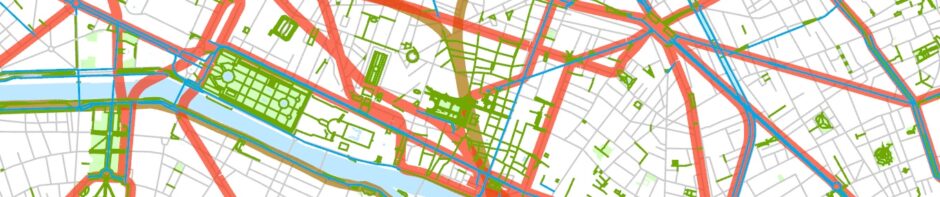
Routes of the Metro and of the Metropolitano, Lima. Raw GIS data from OpenStreetMap.

[1] Lima’s Metro does not really go downtown, and it doesn’t come very close to Lima’s newer quasi-CBD in and around Miraflores and San Isidro either (see map). This is odd in that nearly all rail rapid transit systems, for reasons that are pretty clear, serve cities’ central business districts. Rail rapid transit, always expensive to build, is really only justified when there are large numbers of passengers, and, even in cities with weak CBDs,  there are still likely to be numerous jobs in government, finance, and tourism in the old downtown, and the largest passenger flows are most probably going to be to and from the CBD. Lima’s Metro comes close to the old Centro Histórico, but the nearest stations are more than two kilometers from the heart of the Centro, and this is an awkward distance to traverse. Jirón Junín, the shortest route between the Miguel Grau station and the Plaza Mayor, takes you along some blocks where (at least when I visited) there were more stray dogs than people; it’s a scary walk. There are buses along Avenida Grau that connect the station with the southern edge of the CBD, but they require an extra fare and quite a few minutes of passengers’ time, and of course you have to figure out an extraordinarily complicated bus system, largely run by private operators.

There do exist a few other Metro systems in the world that don’t go to a CBD, but they’re almost all exceptions that prove the rule. Bangkok’s Skytrain doesn’t serve the older CBD on the Chao Phraya River, but its two lines come together next to Siam Square, the effective center of Bangkok’s modern commercial life. In Miami, the Metro, as in Lima, only skirts the CBD, but it’s connected with Miami’s downtown via the Metromover. There’s also the case of San Juan’s Tren Urbano, which serves the newer commercial district Hato Rey but has never made it to the old city. This line is not generally considered to be a great success. It attracts fewer passengers than any other American rail rapid transit system except Cleveland’s,2 which also serves only the edge of downtown. Lima’s Metro arguably has the poorest connection with its main commercial districts of any rail rapid transit system in the world.

Let me add that the fact that Lima’s Metro has attracted numerous passengers without serving its CBD very well does suggest that some of the received conceptions of how people move in cities may not be quite right—this appears to be an under-researched subject. It could be the case that the “desire lines” of people of modest income in Third World cities are quite different than those of middle-income people in North America and Europe. That is, these people could have less interest in travel to the CBD, since the jobs—and products—present there may not be available to them. One of the stops on the Metro where the largest number of people get on and off is Gamarra, the site of a truly enormous clothing market and of bus and van connections to many places. It may be a more important node for relatively poor people than the Centro Histórico.

Lima_Metro_San_Borja_Sur_Av_Aviacion

Lima’s Metro, over Avenida Aviación.

[2] Lima’s Metro is entirely elevated. It’s even been claimed to be the world’s longest urban elevated railroad at 24 km (plus 10 km of surface tracks). (This claim is somewhat dubious.) Its status as an elevated railway is one of the chief reasons it does not serve the Centro Histórico. The line is nearly all built in the center of exceptionally wide streets and is very heavily engineered, in part to mitigate the area’s substantial seismic risks. Its heavy presence makes it a somewhat overbearing neighbor, and it would not have fit (or been very welcome) in the relatively narrow streets of the Centro Histórico or of places like Miraflores and San Isidro.

View from the Miguel Grau station, the closest station to the Centro Histórico.

[3] Lima’s Metro mostly serves modest neighborhoods. Many new Metro lines quite self-consciously serve a mix of districts. They do this in part to be politically attractive and to forestall accusations that their construction favors either the rich or the poor. Lima’s Metro was quite self-consciously built to serve, first, Villa El Salvador in the south, and then, when its general alignment was finally settled on, San Juan de Lurigancho in the north. Villa El Salvador and San Juan de Lurigancho are both huge settlements of (with some exceptions) poor or middle-income people. Villa El Salvador started life as a pueblo jóven (squatter settlement) and is famous for its local activists. San Juan de Lurigancho has a million people, few of whom are wealthy. “Public” transport at both ends of the lines was largely in private hands before the arrival of the Metro and mostly involved vans (“combis”) that travelled only when very full. Combi transport was (and is) neither rapid nor comfortable, and the Metro’s routing was in part determined by the very reasonable desire to improve transport for a large number of people.

The Metro does skirt the far edges of Miraflores and San Isidro, upscale residential neighborhoods and the centers of much of Lima’s modern commercial life. There are two or three stations within three or four kilometers of these neighborhoods, notably La Cultura and San Borja Sur. La Cultura, where the National Library and the Museo de la Nación (but hardly any residences) are located, is connected with San Isidro by freeway. There are bus routes to San Isidro, but the three-kilometer walk is not pleasant. I also walked from Miraflores to San Borja Sur station. The first part of this journey is fine. As in other big Latin American cities, the most bustling, pedestrian-friendly parts of Lima are upscale commercial/residential neighborhoods. But the last kilometer, past large single-family homes with three-meter-high walls topped by electric fences, is somewhat strange. The only other pedestrians were deliverymen, who were communicating with residents by intercom. The Metro does not have the same kind of easy relationship with its surrounding neighborhoods—and perhaps especially its well-off neighborhoods—that one would find in a European city. Even in the poorer neighborhoods, where there are more pedestrians, you often have to cross a major street to get to the station.

[4] The Metro took nearly thirty years to build. Construction was started in 1986, during a brief period of optimism about Peru’s future, and a small section of surface track at what is now the southern end of the line opened in 1990. Since it didn’t go anywhere very useful, it attracted few passengers. Work on the line practically ceased for twenty years, a period when Peru was experiencing out-of-control inflation, the Sendero Luminoso revolt, and other problems. Work resumed in 2009, and the southern two-thirds of the line were completed in an astonishing 18 months. The northern third, which had not even been started previously, opened 33 months later, in 2014, 28 years after Metro construction had begun.

The San Isidro Aramburú station on the Metropolitano BRT, in the middle of the Vía Expresa.

[5] The Metro has BRT competition. Besides finishing the Metro, Peru’s government took advantage of the good economic times of the early 21st century to build a bus rapid transit route, confusingly called the Metropolitano.3 Unlike the Metro, it serves the Centro Histórico, Miraflores, and San Isidro, running down the center of a freeway, the Vía Expresa, from south of the Centro Histórico to Barranco, a bit beyond Miraflores. This part of the route is genuine, high-quality BRT, resembling the major lines in Bogotá. The bus right-of-way is completely separate. It includes passing lanes, permitting express service. You pay with a smart card as you enter a station. North and south of the Vía Expresa, the Metropolitano still has its own right-of-way, and you still prepay your fare, but buses do have to contend with traffic lights. The Metropolitano has been drawing approximately as many riders as the Metro. The Metropolitano route, oddly, does not intersect with the Metro at any point.

The Gamarra station.

There seems to be a consensus that Lima’s Metro is a success. It has been attracting approximately 350,000 passengers a day on weekdays and Saturdays, more than had been predicted. This is a respectable figure for a single line in an urban area of medium density. Trains, unfortunately, run very full, but that of course is a sign of success, and surveys suggest that passengers are generally pleased. The fares, 1.50 soles (USD 0.45), cover something like two-thirds the cost of running the trains, so the subsidies required are not ruinous. Linea 1 is considered so successful that two additional lines are now under contract. Both will be subways and one will serve the Centro Histórico (the other line will reach the Airport). Linea 2 will cross Linea 1 at Miguel Grau and the Metropolitano at its Estación Central, thus improving connectivity enormously. Additional routes, including lines to Miraflores and San Isidro, are on the drawing boards. If and when these lines are completed Lima’s Metro will be much more like Latin America’s other major rail rapid transit systems.

  1. Much of the factual information in this text comes from: Jorge Kohon. Metro de Lima : el caso de la Línea 1. Caracas? : Banco de Desarrollo de América Latina, Corporación Andina de Fomento (CAF), 2016. Also, the newspaper El comercio has good coverage of Lima transit and has proven a fine place to check dates. An excellent summary of the transport situation at the beginning of the 21st century can found in: Roberto Goldszer. “Le projet de métro à Lima,” pages 323-328 in: Urban mobility for all = La mobilité urbaine por tous. Lisse : A.A. Balkema, 2002.
  2. List of United States rapid transit systems by ridership“, Wikipedia, examined 24 August 2016.
  3. See the Metropolitano’s Website for more information.

Posted in Transportation, Urban | Leave a comment

Walking, running, bicycling, and taking trains in central São Paulo

The São Paulo metropolitan area is by most measures the largest or second largest in the Western Hemisphere,1 but it doesn’t have a very distinct image in North America or Europe. In so far as most foreigners think of São Paulo at all, it’s often as a congested, polluted, and crime-ridden place. This image is not completely inaccurate. São Paulo’s 21 or so million people2 own more than seven million cars,3 and traffic jams are frequent. São Paulo is said, as a result, to have more helicopter commuters than any other city in the world. The urban area is surrounded by hills, and air quality can be terrible. Furthermore, the crime rate is indeed high, although it’s been dropping rapidly over the last fifteen years. In 2015 the murder rate was 8.56 per 100,000,4 among the lowest murder rates in Brazil, roughly a sixth that in Saint Louis—but twice New York’s.


Academic studies of São Paulo can also present a rather harrowing picture. Perhaps the best-known English-language work on São Paulo is anthropologist Teresa Caldera’s City of Walls,5 which depicts a city in which anyone who can has retreated to a gated community and stopped setting foot in socially-mixed public places, leaving the streets to the poor. Some of the extensive Brazilian academic literature on São Paulo also documents the city’s extreme inequalities and intractable planning dilemmas.6

Three recent trips to São Paulo suggest that this view is somewhat out of date. Central São Paulo is certainly a gritty place—graffiti are everywhere—but it has a flourishing pedestrian life, healthy public spaces, and pretty good, and improving, public transportation. In the area between, roughly, the old Centro and Itaim Bibi, streets and parks and the rail system are filled with people, apparently of all social classes, and the new ciclovias (bicycle paths) are attracting a fair number of riders.

Particularly impressive is Avenida Paulista, perhaps São Paulo’s symbolically most important street (see photo).

São Paulo--Av Paulista Sunday

Avenida Paulista on a warm Sunday afternoon in winter.

Avenida Paulista is both a business and a shopping street, and there are apartment buildings at its southeastern end. A substantial number of big companies (Citibank, for example) have their headquarters on the street, and there are several shopping malls and numerous other stores as well. It’s also where major political demonstrations take place. The sidewalks are crowded day and night and could hardly feel safer. Under the current administration of prefeito (mayor) Fernando Haddad, the street has been closed to motorized-vehicle traffic on Sundays. Closing Avenida Paulista must have felt roughly as it would feel in Chicago to close North Michigan Avenue and LaSalle Street on Sundays. The street was just jammed on the rather warm dry Sunday when I was there. There were plenty of diversions. Numerous musicians, for example, had set up shop. Hundreds of people were selling things (mostly craft products). Buskers dressed in fantastic costumes were drawing huge crowds. There were dozens of open-air restaurants, many of which were broadcasting the French/Portuguese Euro championship soccer game. There were also vendors of sorvete (ice), agua de coco (coconut water), and numerous other goodies. Children were diverting themselves using updrafts from subway grates to send light objects high in the air. But it’s possible that walking up and down and people-watching were the major activities of Avenida Paulista’s Sunday crowds—and perhaps of those on weekdays too. There may be no better place in the country to see masses of Brazilians in all their variety.

Also striking is the Minhocão [“big worm”] (see photo).

São Paulo--Minhocão curve

The Minhocão on a Sunday afternoon.

This road, officially the Via Elevada Presidente Costa e Silva, is ordinarily one of the world’s most appalling elevated urban freeways, running only a few meters from apartment buildings in a socially complicated but basically middle-class neighborhood—and said to be one of the factors in the neighborhood’s deterioration. It too has been closed to motorized traffic on Sundays, as well as at night and on late Saturday afternoons. The Minhocão was crowded when I was there, mostly with (often lightly dressed) people walking, running, or bicycling its 3.5 kilometer length. There were also a certain number of picnickers and agua de coco vendors. It’s an incredibly scenic place. You get a startlingly new view of the landscape when you walk along it. Since it has several turns and hills you also get constantly changing views of tall buildings in distant parts of the city as well as of the bustling streets below.

The city’s major inner-city park, Ibirapuera Park, is as crowded as Avenida Paulista (see photo).

São Paulo--Ibirapuera Park pathway

Ibirapuera Park walking/running/bicycling path.

The park features a walking/running/bicycling loop, numerous less formal walking paths, basketball, weightlifting, and skating facilities, and several excellent museums. While I acknowledge that I have no way of identifying the social class of people using the park, it’s pretty clear that there are people there from many social groups.

There are, in fact, substantial numbers of pedestrians in most of the middle-class and wealthy residential neighborhoods in central São Paulo. These neighborhoods are densely built-up with apartment buildings, and generally they feel safe, at least by day. But one should not be naïve here. Most high-rise apartment buildings are surrounded by tall fences and have armed guards. And there are places in the Centro such as “Cracolândia” where there are concentrations of down-and-out people on a much larger scale than anything you’d see in, say, the East End of Vancouver or the homeless peoples’ district of downtown Los Angeles. Even if one avoids the favelas (as I did) and skips Cracolândia, the visitor to São Paulo cannot help but notice that there are large numbers of marginalized or just plain poor people in the city. It’s not clear to a foreigner how much of a danger these people pose, but well-off Brazilians clearly think the danger is immense. This fact colors the use of public space in São Paulo and other Brazilian cities. American cities of course have an analogous problem.

There are also some environmental barriers to pedestrian life. Sidewalks are often cracked. There are steep hills to contend with. And, on rainy days, the sewers are overwhelmed. But you encounter these problems in parts of North America and Western Europe too. Central São Paulo is generally a pedestrian-friendly place.

Other non-automotive transportation facilities have improved too.

The Haddad administration has made a major effort to build ciclovias (bicycle paths).7 More than 400 km of paths are planned, and most of them are in place. Here’s a map:

Map, ciclovias (bicycle paths), São Paulo, Brazil

Ciclovias in São Paulo, shown by dark green lines. GIS data for ciclovias are from Vá de Bike. GIS data for streets, parks, and water are from the Geofabrik version of OpenStreetMap. The thin black lines show municipal boundaries. These were generated from a file available at GADM. I do not have data for ciclovias outside the municipality of São Paulo.

I can’t claim that most of the paths in the central city were extremely busy when I was there, but they were certainly attracting users. A newspaper story8 suggests what should have surprised no one. Well-off cyclists, mostly living in the center of the city, generally use the paths on weekends, for recreation. Relatively poor people, mostly living in the periphery, use them to get to work, and they do this every day and in substantial numbers.

A few of the paths, along water courses like the Pinheiros River, allow traffic-free movement for quite a distance, but most of the ciclovias run along urban streets. Ciclovias on major streets like Avenida Paulista and Avendida Faria Lima are designed in a way that seems a bit odd to a North American: They are built in the center of the street (see photo). This clearly solves the “dooring” problem and also assures cyclists’ visibility. It may also help at intersections, where special traffic lights for cyclists provide at least some protection from turning motor vehicles. It can be a long wait, though, for the lights to change. São Paulo’s ciclovias are not built for speedy cycling.

São Paulo--Av Paulista ciclovia on weekday

Avenida Paulista ciclovia on a weekday.

The ciclovia program has apparently aroused a huge amount of opposition. Its opponents’ chief argument is that a great deal of money is being spent on facilities that are used by only a tiny number of people. There is surely an element of truth here, and the expansion of the program has been halted for the moment.

Bicycle paths have recently been built in many other Latin American cities too, for example, Mexico City and Buenos Aires. In many ways ciclovias seem an odd fit for big Latin American cities, where traffic can be heavy and drivers have a reputation for being particularly aggressive. But, in fact, aggressive driving is far less of a problem for cyclists—and pedestrians—than in, say, Middle Eastern or South or Southeast Asian cities. Traffic lights in Latin America are usually obeyed, and sidewalks are normally free of motorized traffic, although you certainly do have to be careful at corners. The ciclovia program in São Paulo and its counterparts in other large Latin American cities seem like exceptionally worthy attempts to reduce the role of the automobile in big cities.

São Paulo’s improving—and still growing—rail transit system is surely of even greater importance than its ciclovia program. Here’s a map:

Map, urban rail lines, São Paulo, Brazil

Urban rail lines in São Paulo. Red is used for lines considered to be part of the Metro. Brown is used for lines that were historically suburban rail routes. Interchange among all the lines is free. Most data were edited from files available through the Geofabrik version of OpenStreetMap. The thin black lines represent municipal boundaries and were generated from a file available at GADM.

All the trains I rode were in good shape. São Paulo’s newest subway line, Linha 4 (the Yellow Line), with its platform doors, its open gangways between cars, its free wifi, and its ubiquitous television monitors, is particularly impressive. In appearance it’s much more like the well-funded, recently built subway lines in Asia and Europe than any other subway line in the Western Hemisphere (see photo).

São Paulo--Inside Yellow Line car

Inside a Yellow Line car.

São Paulo is also (I believe) the only large city in the Western Hemisphere that has fully integrated its old suburban lines and its subway system. Although the rail lines and the two different subway companies have retained their separate corporate identities, elaborate passageways have been built to connect the systems (see photo), and one ticket gets you just about anywhere you want to go.

São Paulo--Pinheiros interchange

The complicated interchange between Metrô line 4 and CPTM (rail) line 9.

It’s true that the old rail lines, like rail lines in most places that were built originally for long-distance transport, sometimes pass rather uselessly through declining industrial areas in the inner city, but they also serve many busy commercial areas (like Avenida Faria Lima and Avenida Luís Carlos Berrini) and of course numerous suburbs that the subway lines don’t reach. The fares—the subject of recent protests—are not strikingly low given the modest salaries for unskilled work. A subway ticket costs $R3.80 (around $US1.20), less if you pay by smart card, but it’s $R5.92 if you need to transfer to a bus. The counterargument is that the one city/one fare policy ends up being a subsidy for the mostly poor people who live in the periphery.

São Paulo’s subway system proper, with 74 route-kilometers, is still rather small given the size of the city, but it attracts more riders per kilometer of track than any other Western Hemisphere metro system, perhaps in part because of its tie-in with the suburban rail lines.9

São Paulo has, in other words, been an enthusiastic participant in the nearly worldwide movement to reduce the role of the automobile in urban life. It’s also clear that some of the negative stereotypes of life in São Paulo are at the very least exaggerated. I can’t claim to be an expert on the city, and I’m perfectly willing to admit that I don’t have much experience at all in the newer suburbs or in the periphery in general, which may well be as pedestrian-unfriendly as in most places. But the central city broadly defined—which covers quite a substantial area—seems to be quite a vibrant, reasonably walkable, and reasonably safe place that, despite the current recession, has been reducing its level of automobile dependence at least modestly in recent years.

  1. World Urbanization Prospects. 2014 edition. New York : United Nations Department of Economic and Social Affairs, 2014.
  2. IBGE releases population estimates of municipalities in 2014.” Brasilia : IBGE, 2014.
  3. Bruno Paes Manso and Rodrigo Brancatelli. “São Paulo vehicle count to hit 7 million this month.” 2011.
  4. Menor taxa de homocídios do Brasil.” São Paulo : Secretaria da Segurança Pública, 2015.
  5. Teresa Caldera. City of walls : crime, segregation, and citizenship in São Paulo. Berkeley : University of California Press, 2000. Let me add that Caldera does acknowledge (on page 320, for example) that parts of central São Paulo do not quite fit her thesis.
  6. Examples: Alvaro Comin (and others). Metamorfoses paulistanas : atlas geoeconômico da cidade. São Paulo, SP : Secretaria Municipal de Desenvolvimento Urbano (SMDU) : Centro Brasileiro de Análise e Planejamento (CEBRAP) : Editora UNESP : Imprensa Oficial, 2012.
    Nestor Goulart Reis. Dois séculos de projetos no Estado de São Paulo : grandes obras e urbanização. São Paulo : IMESP, 2010.
  7. Muita tinta e 2 anos depois, ciclovias passam a fazer parte da vida da cidade,” Folha de São Paulo, 4 June 2016.
  8. Vazio na região central, bicicletário lota na periferia de São Paulo,” Folha de São Paulo, 9 March 2015.
  9. List of Latin American rail transit systems by ridership.” Wikipedia. Consulted July 15 2016. The intense usage of lines can of course partly be attributed to the fact that the system isn’t yet very substantial. As lines to lower-density areas are added, riders per kilometer of track will probably go down.

Posted in Transportation, Urban | 2 Comments

McDonald’s is not moving to downtown Chicago

Newspaper headlines have claimed that McDonald’s is moving its headquarters from suburban Oak Brook to “downtown Chicago.”1 It isn’t. The move (if it happens) would be to the Harpo Studios site, which is at 1058 West Washington Boulevard. This is in a neighborhood that historically mostly contained industrial buildings and warehouses. These days, the largest and most solid of these have been converted into “loft” housing. More modest industrial buildings have been replaced by expensive midrise housing—or by parking lots. Here’s a map:
mcdonalds2

The large black circle shows the location of Harpo Studios. The heavy black line shows how Chicago’s central business district is defined by the Chicago city data portal. Most observers would probably say that it is somewhat overbounded, especially on the west. The green lines are CTA rail lines, and the green circles are CTA rail stations.

Here’s a photo of Harpo Studios that gives a sense of context:

Chicago--Harpo etc 2

Harpo Studios is on the left. The reddish building contains “lofts.” The fence on the vacant lot on the right has a sign advertising three-bedroom apartments to be built on the site that will cost “in the 800s.” There are still some industrial facilities operating within a few blocks of the area shown, but they’re disappearing fast. Three or four blocks away the old food-processing Fulton Market has partly become a district of expensive, fashionable restaurants. This area is not “downtown.” It’s a mile to the Loop proper, across a ten-lane freeway and along streets that carry a huge amount of traffic during rush hour. The official community area name is Near West Side. Real estate agents call it the West Loop.

Google has set up its Chicago offices in Fulton Market, and one of the implications of the newspaper stories is that the “West Loop” might become a new center of corporate headquarters. I wonder. Google is, obviously, different. It isn’t quite comfortable with a traditional corporate image. Its New York offices are in the old Port Authority Building in Chelsea, not far from the High Line and a couple of blocks from the extremely fashionable Meatpacking District. Chicago’s Fulton Market is sometimes known as the Meatpacking District too. It’s in some ways very similar to New York’s. It had comparable historical functions, and it’s now quite the place to go (although its housing is lower-density and much cheaper than New York’s). Google appears to have chosen its office locations to enhance its (fading) bohemian image. But McDonald’s? There’s something a bit odd here.

A suburban acquaintance once revealed that he thought that “downtown Chicago” referred to the area from roughly Wrigley Field to Congress Expressway within a mile or so of the Lake, a huge, largely residential area of which the CBD is a tiny part. It’s more or less the area where driving is difficult and free parking impossible. People who drive everywhere sometimes do not seem aware of distinctions within dense areas. You could argue that the area around Harpo Studios is a suburbanite’s dream urban location. Traffic moves more freely than it does in the Loop. There are still some open parking lots around. The sidewalks are not too crowded. On nice days middle-class people can be found eating in outdoor restaurants not far away. Could it be that a misunderstanding about the meaning of “downtown” explains McDonald’s’ location decision?

Of course, it’s wonderful for Chicago to acquire new corporate headquarters, as long as only a modest bribe had to be paid. Headquarters bring in tax receipts and prestige. There are also environmental factors to consider. McDonald’s’ old headquarters in Oak Brook is very difficult to get to by public transit. Harpo Studios is two blocks from an El station. It would be hard to argue that the move is a bad thing in any way. But it does make sense to be correct about its spatial significance.

  1. “McDonald’s to move headquarters to downtown Chicago,” Wall Street Journal, June 13 2016. “McDonald’s moving headquarters to downtown Chicago by 2018,” USA Today, June 13 2016.

Posted in Urban | Leave a comment

Apartment buildings on arterials in Chicago

There has been a large amount of infill residential construction in Chicago in recent years despite the city’s static or declining population.1 Most of this building has occurred in prosperous neighborhoods on the North Side or close to downtown. “Urbanist” observers have argued that the new construction will support Chicago’s transformation into a more pedestrian-friendly and less automobile-dependent place. In this brief essay, I argue that, because much of the building has been occurring in relatively pedestrian-unfriendly areas, this hope may be misplaced. My argument is somewhat complex, in that it involves a consideration of Chicago’s zoning pattern, a look at the history of Chicago’s neighborhood commerce, and some thoughts on the meaning of “walkability.” Let me explain.


Many writers2 have pointed out that zoning laws are one of the reasons that American cities aren’t denser. That is, for example, the reason that Chicago’s multi-unit dwellings are found mostly along the Lakefront

chicago_more_than_50_percent_10_or_more_units_2

Tracts in Chicago and inner suburbs where at least fifty percent of the housing units are in buildings with ten or more housing units. Data from American Community Survey, 2008-2012.

is not only that, in a flat city that lacks natural landmarks, the Lakefront is the most attractive place to be. It’s also due to the fact that zoning prevents multi-unit buildings from being built anywhere else. Here’s a somewhat simplified map showing where multi-unit residential buildings may be built in Chicago without special permission.

zonedmultunit 2

Areas zoned RM, DR, or DX. PD areas (mostly in or near CBD) are also available for multi-unit housing, but special authorization is required. Data from Chicago’s Data portal.

Zoning codes, of course, aren’t set in stone, but they’re not easy to change. One of the reasons that multi-unit buildings in Chicago cover a larger area than is zoned for them is that much of the North Side Lakefront was downzoned during the late 1970s. It would be politically very difficult to restore the old code. Many people would like to do so, however. Blogger Daniel Kay Hertz has made of point of lamenting the difficulty of building more densely in desirable Chicago neighborhoods like Lake View and Lincoln Park, and in the nearly-as-desirable corridor stretching along Milwaukee Avenue on the Northwest Side. Large parts of these neighborhoods are mostly zoned either for single-family housing or for two-, three-, or four-flat dwellings.

In fact, there is what amounts to a major geographical loophole in the zoning codes. Many of the arterial streets in North and Northwest Side neighborhoods in Chicago are actually zoned “business” or “commercial.” Apartments over stores are permitted. In practice, so are apartment buildings as long as they’re not very tall. On this map, the red areas are zoned business or commercial:

zonedcommercial2

Areas zoned B and C on the North Side of Chicago.

Chicago (as many people have pointed out) has much more business/commercial zoning than it needs. A city in which most people shop for food at supermarkets and buy just about everything else at big-box stores and on the Internet does not need the thousands of tiny shops on arterial streets that the zoning code encourages. And, in fact, most of the commercial districts defined in the zoning code are not very healthy. Many of the storefronts on, say, Ashland, Western, and Milwaukee Avenues and Irving Park Road are closed. Others are given over to enterprises that appear to attract very little business. Some of the specialized shops are, I’ll admit, of some interest. There are exotic restaurants on Irving Park, and book and comic-book stores on Milwaukee that could not pay the rent in a more desirable commercial district. But far more common than comic-book stores are, say, auto parts stores, nail salons with few customers, and newly built suburban-style drive-in restaurants and banks. Even commoner than that are older, typically small residential buildings with no stores at all. Any ground-floor commerce that once existed has long since disappeared.

One of the reasons that these commercial districts are so marginal may be that the arterial streets are miserable places for walking. This is especially true of four-lane streets like Ashland and Western Avenues and Irving Park Road west of Ashland. They have a lot of vehicular traffic. During rush hour there are even traffic jams.

That is to say, while I don’t know exactly how to define walkability, it’s surely more complicated than the WalkScore Website metrics imply. I suspect it has a great deal to do with whether motor vehicles outnumber pedestrians. Most pedestrians are perfectly happy to walk on streets like Fifth Avenue in Midtown Manhattan and the Champs-Élysées in Paris even though there is a huge amount of traffic flowing nearby. There are just about always a huge number of pedestrians too. To walk by oneself on one of these streets at rush hour (while it’s never likely to happen) would probably feel uncomfortable. Most pedestrians, however, are happy to walk by themselves on residential streets with hardly any traffic. Again, the dynamic seems to be the ratio of vehicles to people. This is not to deny that there are other factors as well—such as the scale of buildings, the presence of high-quality sidewalks, and the existence of places to walk to. Streets like Ashland Avenue in Lake View and Lincoln Park and Irving Park Road west of Ashland are poor streets for walking because they have many more cars than pedestrians. The near absence of interesting commerce and the massive amounts of traffic reinforce each other to discourage pedestrian activity.

But, curiously, one of the places where there has been the largest amount of residential construction in Lake View and Lincoln Park (and elsewhere on the North Side) in recent years is on the arterials. This makes perfect sense in many ways. The neighborhoods are generally considered unambiguously desirable. Most of the side streets in these areas are more or less completely gentrified. Older buildings in poor shape on the side streets have for the most part already been fixed up or replaced, zoning laws in any case discourage denser infill, and there is little opportunity for new building. But, because the older buildings on the arterials have not been seen as very desirable, they have typically not been renovated, and every so often one becomes available to developers. The zoning codes do permit new apartment construction on these “commercial” streets with minimal need for a waiver. Because all these streets have reasonable bus service, there’s even a certain amount of urbanist logic in building on them, although just about all the new housing on these streets comes with plenty of parking.

I took a close look at two mile-long arterial corridors where there has been recent construction, one in Lake View and one in a nearby but still slightly marginal neighborhood.

The first corridor is Ashland Avenue between Belmont Avenue and Irving Park Road. Much of the street once looked something like this:

Chicago--Ashland Ave older buildings cropped

The neighborhood around Ashland Avenue underwent a considerable amount of gentrification during the 1980s and 1990s, but Ashland itself was somewhat neglected by developers until approximately 1996, when a Whole Foods opened toward the southern end of the corridor and Wieboldt’s, a closed department store across the street, was converted into “lofts.” In the years since, Ashland has been slowly transformed from a tired commercial and residential street into a more densely built-up mostly residential one. Nearly half the older buildings have been replaced, and the process is continuing. Here’s a map:

ashland5

On this and the similar map of part of Irving Park Road, red is used to show new, generally post-1998  construction (but some quite recent). Only buildings that front on the arterial are colored. Source of data: the building footprint file downloaded from the city of Chicago’s Data portal, modified approximately when there has been building since the dataset’s compilation.

Some of the new construction consists of buildings that are very much like the three-flat four-story condo buildings that have become the commonest kind of new building on the side streets, although they can have a store instead of a stoop and living space on the ground floor:

Chicago--Ashland single bldg 2

Most of the new buildings are somewhat larger though. The commonest type is the six- or eight-unit apartment building, like this:

Chicago--Ashland new construction and advertisement

Sometimes two or more of these are put together:

Chicago--Ashland row of apt bldgs

There are also a few much bigger (but not much taller) apartment buildings.

Chicago--Ashland apartment buildings

It’s difficult to provide a precise statistical portrait of this corridor, because it’s spread over five (formerly six) census tracts that extend a quarter mile on both sides of Ashland so that the corridor itself covers only a small portion of the tracts. Per capita income was $44,514 in 1999 ($63,253 in 2014 dollars). It rose to $68,529 in the 2010-2014 American Community Survey (which has 2009-2013 income data but reports numbers in 2014 dollars). The number of residents has also increased modestly. In 2000 the population was 11,359. In 2010/2014 it was 12,629. There is no way to be certain about where the new residents were living, but, because new buildings on the side streets were generally not much bigger than the older buildings they replaced, it seems likely that the apartment buildings on Ashland house a large portion (and maybe most) of the neighborhood’s newcomers. The percentage of workers 16 and over who took public transit to work also increased somewhat between 2000 and 2010/2014, from 38.34 to 44.91. There are two CTA rail stations within a block or two of the corridor, and I don’t doubt that some of the residents of the new buildings do take advantage of the bus lines that stop outside their door. But there are still few pedestrians on Ashland Avenue. It’s just not a nice place to walk, and, with the exception of that Whole Foods, there are few destinations to walk to.

The second corridor I looked at—Irving Park Road between Sacramento and Central Park Avenues just west of the North Branch of the Chicago River—is at an earlier stage of what may be a similar process.  Much of the street doesn’t look very different than it did in, say, the 1990s (or maybe the 1920s!):

Chicago--Irving Park mixture

More of the older buildings, however, have been replaced by suburban-style commerce. There are also a few new apartment buildings on Irving Park Road, some larger than anything on Ashland:

Chicago--Irving Park Rd new apt bldg and suburban detritus

Here’s a map:

irving2

This corridor (in the Irving Park community area) is much poorer than the Ashland corridor and has hardly been gentrified at all; very little of the old housing stock on the side streets has been replaced or seriously renovated. Per capita income in the six (now eight) tracts bordering Irving Park Road increased marginally from $16,532 in 1999 ($23,491 in 2014 dollars) to $23,798 in 2009/2013 (again, the corridor itself makes up only a small part of the tracts, which cover an area up to half a mile from Irving Park Road). Population hardly changed. It was 28,990 in 2000 and 28,444 in 2010/2014. There is no way to be certain about population change at the building level, but it seems possible that the addition of new apartment buildings reduced what would otherwise have been a greater decline in population. Public transit use also held nearly steady. The percent of the working-age population that took public transit to work rose from 20.03 to 22.04. (There are no rail stations close to this corridor.) The area’s stability applies to its ethnic mix as well. It was 55.1% Hispanic in 2000,  56.4% Hispanic in 2010/2014.

Despite the area’s lower-middle-class status, it is on the North Side; it’s pretty safe; and developers have had enough confidence to put up apartment buildings when lots on Irving Park Road have become available. The process is continuing; several new apartment projects are in the works. It’s possible that this corridor will look something like the Ashland corridor in a few years. But, in general, despite the new buildings, there is less sign of pedestrian life on Irving Park Road than in the Ashland corridor. There seems to be even more traffic, and there is nothing anything like as attractive as a Whole Foods to walk to.

Compared to, say, a freeway, or a railroad yard, or a coal-burning power plant, a four-lane urban arterial is a minor disamenity. But it is a disamenity, and its presence doesn’t just affect people living along it. It affects the surrounding neighborhoods too, since the arterials are so awkward to cross, especially on foot. (There are traffic lights only every quarter mile or so.) The city does seem to understand the problem. It’s installed green median strips along Ashland Avenue and Irving Park Road, but these help only marginally, especially since they weren’t put in at corners where a left-turn lane was wanted.

Many other North Side arterials have undergone a similar transformation. The streets appear to have been (or are being) transformed on the basis of urbanist principles, but it’s not clear that there’s been much of an urbanist effect. It’s even possible that the increase in population has generated more traffic, and hence lowered the neighborhoods’ walkability. The NIMBY argument that development = traffic may not make much sense in more pedestrian-friendly areas, but perhaps it does here.

It could certainly be argued that any kind of increased density is a good thing, but it’s still odd to have the densest housing in the least walkable parts of neighborhoods.

Chicago’s North Side is hardly the only place where this phenomenon is common. New or newish apartment buildings on urban arterials can be found all over the United States. They were apparently built in many cases for the same reasons as in Chicago: the availability of land; the absence of protesting neighbors; and oddities of the zoning code. I can’t resist adding that there is a precedent in Chicago, which appears to be the only city in Western world whose most prestigious housing overlooks what is for all intents and purposes a freeway, that is, Lake Shore Drive.

It’s hard to see what one could do about the problem except to downsize the arterials radically. If it were up to me, that’s certainly what would happen. The Chicago Transit Authority does in fact have a plan to put bus rapid transit on Ashland and Western Avenues, which would mean eliminating a lane of traffic and forbidding most left turns. The fact, however, that this plan has elicited an enormous amount of opposition has put it on hold. Automobile drivers do not easily give up the right to degrade an environment. Radical downsizing of the arterials doesn’t seem likely to happen soon. Until it does, streets like Ashland and Western Avenues and Irving Park Road present an enormous long-term obstacle to transforming the North Side of Chicago into a more pedestrian-friendly place even if they are acquiring new multi-unit housing.

  1. It could be argued that, except for a hiatus during the Great Recession, the current pattern of infill residential construction goes back to the 1990s.
  2. There is a huge literature on the history—and effects—of zoning in American cities. Recent examples:
    (1)
    William A. Fischel. Zoning rules ! : the economics of land use regulation. Cambridge, Mass. : Lincoln Institute of Land Policy, 2015.
    (2) Sonia A. Hirt. Zoned in the USA : the origins and implications of American land-use regulation. Ithaca : Cornell University Press, 2014.
    (3) Emily Talen. City rules : how regulations affect urban form. Washington : Island Press, 2012.

Posted in Urban | Leave a comment

Neighborhood types in Chicago, 2010

The maps below present a classification of Chicago’s residential census tracts based on multivariate analysis. This approach (sometimes called social area analysis or factorial ecology in geography and sociology) is often used to classify small areas in cities. The ten neighborhood types identified on the maps were derived through a two-step process. First, the TRYSYS program was used to factor 34 important tract-level census variables by the Tryon “key-cluster analysis” method. The data come either from the 2010 census or from the 2008-2012 American Community Survey. Three oblique dimensions were identified. Then each tract was scored on the three dimensions (using a simple sum of standardized scores), and tracts were cluster-analyzed using TRYSYS‘s iterative partitioning method. Robert B. Dean did the statistical analysis.


These maps are comparable to those generated for 1990 and 2000 data when I was working at the University of Chicago Library. Essentially the same variables were used, and nearly the same geographic area was covered. The three dimensions (or clusters) are very similar to the first three dimensions found in the 1990 and 2000 data (although the order of the first two is different). In both 1990 and 2000, a fourth dimension was identified, associated with family type and age. A similar dimension in the 2010 data is not at all significant, and, in conjunction with this, the geographical pattern of neighborhood types has changed in some small ways. For example, the well-off/young-adult/non-family area roughly along North Halsted Street that was identified in the 2000 census analysis has vanished in 2010, mostly subsumed into areas classed as very well-off and very urban (type 1). But, in general, the broad pattern of Chicago’s social geography appears to have changed only in subtle ways in the first decade of the 21st century. The area of gentrification on the North Side has clearly moved west and north from Wicker Park and Bucktown, into Ukrainian Village, Logan Square, and even Humboldt Park. Gentrification has also moved west from downtown. Click here for some maps that demonstrate that there was a considerable amount of ethnic-specific internal migration in the area. Note that, because the classifications have changed, the color schemes of the 1990, 2000, and 2010 neighborhood-type maps, while similar, are not completely comparable.

No claim can be made that this is a definitive analysis of neighborhood types in Chicago. It is in the nature of this kind of analysis that a change in the variables selected or in the parameters set by the analyst can change the results significantly. There is also the issue that the 2008-2012 ACS data are not likely to be as reliable as earlier long-form data. The best that can be said is that the maps may provide one useful way of analyzing the differences in Chicago’s residential areas.

Here is a map showing neighborhood types in Chicago and its inner suburbs. Nominal scale is 1:250,000. (Click here for key.)

Map showing result of cluster analysis of circa 2010 data for Chicago's census tracts that resulted in classification into ten neighborhood types, Chicago and vicinity, Illinois


Here is a map showing neighborhood types in the Chicago region. Nominal scale is 1:700,000. (Click here for key.)

Map showing result of cluster analysis of circa 2010 data for Chicago's census tracts that resulted in classification into ten neighborhood types, Chicago region, Illinois and surrounding states


Posted in Urban | Leave a comment

The extreme high density of the central portions of the New York area

Sprawl supporters like Wendell Cox and Robert Bruegmann1 (and many other writers) have gleefully pointed out the Census Bureau’s somewhat counterintuitive claim that the Los Angeles urban area is denser than New York’s. Anyone familiar with Los Angeles and New York would understand that the explanation for this must lie mostly in the different characters of the outlying portions of the two urban areas. New York (like other eastern cities) includes a large number of suburban areas with two-or-more-acre zoning. Such low-density suburbs are almost impossible in western cities, where rough terrain and government ownership of much of the mountainous land have discouraged their formation.


One way of demonstrating the extraordinary density of New York’s central portions that I haven’t seen pointed out requires looking at 2010 population density by census tract for all 73,000-odd U.S. census tracts (data from NHGIS). The densest tract, with 196,409 people per square kilometer (508,697 people per square mile), turns out to be in Chicago: a tract created especially for the 2010 census that contains a single apartment building, at 5415 North Sheridan Road. 163 out of the next densest 166 tracts, however, are in the New York area (all but one in New York, N.Y.; the three non-New-York tracts are in San Francisco). New York’s overwhelming dominance extends down the density hierarchy. Out of the 436 census tracts in the United States with population densities of more than 30,000 people per square kilometer (77,700 per square mile), 409 are in the New York area (401 in New York City). Of the remaining 27, 12 are in the San Francisco Bay Area (11 in San Francisco), 6 in Los Angeles County, 5 in Chicago, 3 in Honolulu, and 1 in Baltimore. Of the 967 tracts with more than 20,000 persons per square kilometer (51,800 people per square mile), 867 are in the New York area (842 in New York City). (The runners-up are: Los Angeles County 29, Cook County (almost all in Chicago) 24, San Francisco Bay Area 22, Honolulu 7, Philadelphia 6, Washington area 5.)

Here are choropleth maps of the New York, Chicago, Los Angeles, San Francisco, and (just for fun) Toronto areas, all at the same scale, showing persons per square kilometer in 2010 (2011 in Toronto) with the same class intervals and colors. Note how different New York looks. There are, for example, hardly any signs of “population densities as high as [in] Manhattan” that some scholars2 have claimed for Los Angeles. All of these metropolitan areas are radically underbounded, but outlying areas (even in Los Angeles) never get beyond moderate densities.

new_york_denschicago_densla_denssf_dens_1toronto-dens-clegend2

This observation jibes completely with the Census Bureau’s recent creation of a “population-weighted density” statistic for urban areas, in which the New York area ends up being considerably denser than any other American urban region. New York has 31,251 “population-weighted” persons per square mile, San Francisco 12,145, Los Angeles 12,113, and Chicago 8,613and these figures include the suburbs.

  1. See, for example: Robert Bruegmann. Sprawl : a compact history. Chicago : University of Chicago Press, 2005.
  2. Quote from page 72 of: Edward J. Soja. My Los Angeles : from urban restructuring to regional urbanization. Berkeley : University of California Press, 2014. Soja makes the same claim on several other pages of this book.

Posted in Urban | Leave a comment

Expedition to Kenosha

Kenosha--Streetcar


I had lived in Chicago for thirty years, and I like trains, but I’d never gone and taken a look at the Chicago area’s only streetcar line, in Kenosha, Wisconsin. So I set out one Sunday afternoon on Chicago’s suburban railroad system, Metra, to visit Kenosha. It was a pretty easy hour-and-forty-minute trip, past familiar cityscape for a while, then along a bicycle trail through well-off suburbs, and finally (and much more speedily) through increasingly open country. Kenosha may in some senses be a suburb of Chicago, but there is plenty of unbuilt-on land close to the state border.

The Kenosha streetcar runs for a mile or so between the Metra station and the Lakefront. Its complete route is a loop, said to be two miles long in all.

Kenosha streetcar, Metra, pedestrian facilities, Kenosha, Wisconsin

Map of central Kenosha showing the routes of the streetcar line and of Metra trains to Chicago. GIS data from Geofabrik version of OpenStreetMap.

Its development was justified on the grounds that the line would serve the inhabitants of Harbor Park, a relatively new townhouse condo development on the Lakefront. The Kenosha streetcar seems to have been an abysmal failure at attracting Harbor Park customers though. The current schedule—7.5 hours a day starting at 10 or 11 for most of the year but on weekends only in winter—would not allow commuters to use it. To get to the Loop by 9 you’d have to take a train at 7:13 or earlier, and the first train from the Loop after 5 wouldn’t get you home until 6:38 or later. Clearly the streetcar line has become essentially a tourist attraction and a modest one at that. The latest figures (2014) from the American Public Transit Association (APTA) suggest that there are 45,054 passengers/year, or maybe 140/day (and you wonder how Kenosha Transit counts people who buy a day pass; if you make several round trips on a day pass, does each one-way ride count as an unlinked trip?). When I was there only one PCC car was running. It was taking about ten minutes to complete a loop, that is, making maybe 45 round trips, or ninety one-way trips/day. That means that there were something like 1.5 passengers per trip. Actually, I was struck by the complete absence of passengers on the Sunday afternoon I visited. There were, however, people out photographing the nicely repainted PCC cars, of which Kenosha Transit has acquired six. To someone who likes trains, it’s quite appealing to see these PCC cars running in a small city. It’s not clear that the cars have much to do with urban transit, however.

The Metra trains, interestingly, were just jammed, especially the late afternoon train back from Kenosha to Chicago. There were standees between Ravinia Park and Ravenswood. But the train wasn’t just serving people attending a Ravinia event. People got on and off at every one of the 27 stops. Perhaps there should be more than nine trains a day on Sunday! It was certainly interesting to contrast a transit service that is filling a real need with one that seems to be serving mostly an aesthetic one. The Kenosha streetcar is, admittedly, probably bringing in some tourist dollars, perhaps enough to justify the $6.37 subsidy per passenger trip (but note that, according to APTA, Metra’s tickets—almost always for a much longer journey—are subsidized at only $4.93/ride).

Posted in Transportation, Urban | Leave a comment

Delhi Metro

Delhi has added more rail transit in the 21st century than any other city outside of East Asia. Although the first line did not open until 2002, there are now 190 route kilometers and 2.4 million riders a day. Among North American rail transit lines, only the New York subway is longer and carries more passengers. And the Delhi subway is still growing. Phase III, now being constructed, will add 160 route kilometers. In a few years Delhi will have one of the world’s largest rail transit systems. Delhi Metro is generally considered an enormous success, not least because the lines were apparently built efficiently, with a minimum of corruption, in a country where this is not the norm.


I’ve been on the Delhi Metro twice, on an earlier trip in 2007 and just recently. There are all sorts of tremendously impressive things about the system. The underground stations and the trains are air-conditioned—a fairly important accomplishment given that temperatures in Delhi were well over 100 degrees every day I was there. The stations are quite spacious and subtly lit (they remind me of stations on the Washington Metro). The trains are very much of the modern type. You can walk from car to car. It is true that there are plenty of reminders that you’re in India. The trains can get awfully crowded (except for the women’s car). And passengers getting on seem incapable of waiting for passengers to get off, and there is thus lots of pushing and shoving. Also, it’s a bit unnerving that you have to get your luggage x-rayed and undergo a body search to enter a station (on one day I had to take out every object from a crowded backpack for a zealous guard). Furthermore, there are frequent announcements warning passengers against picking up unattended objects since they could be bombs. Still, who could argue with the proposition that Delhi Metro is a major achievement?

I have one pretty major caveat, however. It’s that it’s practically impossible to walk to the Metro stations, at least in central Delhi.

When I first rode the Delhi Metro in 2007, I decided to follow the elevated line that emerges a few blocks west of Connaught Circle, to take pictures and to get a feel for how the line fit into the neighborhoods it passed through. I gave up after a couple of stations. One problem is the near absence of sidewalks along the route (see below). In most cases a sidewalk had once been built, but it’s been encroached on in places and has not been maintained in others, so that there is more trash-filled pothole than sidewalk. Most Indians just walk in the traffic lane. Even more serious, you take your life in your hands every time you want to cross a street. There are few traffic lights, and little attention is paid to those that exist. Some Indian intellectuals say they hate the anthropologist Louis Dumont’s phrase “homo hierarchicus,” an attempt to characterize the Indian people in light of the caste system. But there is no doubt that there is a hierarchy on Indian roads. Third World traffic rules are in force everywhere. The larger vehicle has the right of way, and pedestrians have no rights at all. Even though automobile ownership is not that high, Delhi is one of the most pedestrian-unfriendly cities in the world—especially British-planned New Delhi with its innumerable roundabouts. You end up wondering just how people get to the Metro stations (or anywhere else). A surprising number take auto or bicycle rickshaws short distances just to avoid having to walk. There may be fewer pedestrians in central Delhi than in any other large city anywhere. There are many fewer pedestrians in the blocks around around Connaught Circle than in, say, downtown Los Angeles, which is famous in North America for being a car-oriented place. In downtown Los Angeles paved sidewalks are universal, and you can cross streets safely.

Delhi--MetroOverStreet2

I visited Gurgaon on my last trip to Delhi. Gurgaon is Delhi’s Rosslyn or Schaumburg or La Défense. Many successful firms have built high-rise office buildings in Gurgaon. There’s also a huge amount of middle- and upper-class housing. A new elevated Metro line to one of Gurgaon’s major office complexes just opened a couple of months ago. It connects to a branch of the Metro that opened approximately a year ago. Both lines were jammed despite the fact that service is frequent, and I had to stand all the way back to central Delhi. But even in shiny-new Gurgaon it’s painful to get to the stations. There are numerous pedestrians in Gurgaon’s office district—and almost no provision made for them. You often have to walk in moving traffic or across muddy fields to get where you’re going (see below).

Delhi--Gurgaon pedestrians

Some Indians attribute the pedestrian-unfriendliness of Indian cities to cultural factors other than the caste system. It is certainly true that Indians on the whole are probably less interested in fitness than just about any of the world’s peoples. You almost never see runners or recreational bicyclists in Indian residential districts. Still, there are plenty of middle-class Indians who enjoy walking. Small parks all over urban India have de facto tracks where people walk in circles. I spent a couple of hours on my last trip to Delhi in Lodi Garden, a wonderful park in New Delhi that contains several enormous centuries-old tombs; lots of large trees (and therefore shade); and thousands of noisy birds. It may be the most pleasant place in Delhi. And it’s just big enough to contain an approximately one-mile walking loop. Amazingly, there were a very large number of people there making the circuit, including some women (see below). It’s true that the park also has a substantial population of unowned dogs, but they do seem to let people pretty much alone (although they can bark furiously at owned dogs being walked on leashes). Clearly, some Indians would walk to Metro stations if it were easier to do so.

Delhi--Lodi Garden3

Delhi of course is hardly the only Third World city where pedestrians are treated with contempt. But, unlike its close competitors in this area (Jakarta and Hanoi, for example), it has made a substantial investment in a form of transport that appears to function fully only when pedestrian access is possible. It’s true that, even as it is, Delhi’s subway is working for millions of people. But a sympathetic foreigner can’t help but wonder whether it wouldn’t be even more of a success if something were done about making it less of an ordeal to walk to the stations. I acknowledge that it would not be a trivial matter to change India’s driving culture—or its long-standing indifference to keeping sidewalks clear.

–May 2014

Posted in Transportation, Urban | Leave a comment